

Customization
The core components for displaying recommendations are highly flexible, allowing you to tailor their usage to fit your specific merchandising strategy and integrate custom data sources. Customization is primarily achieved by editing the source code.
This guide covers the flexibility of our primary recommendation component and provides general code customizations for the feature.
The Flexible Recommendation Slider Component
The <ProductRecommendations /> component is the foundational tool for displaying associated products anywhere in your application. While it uses the combineWith product attribute by default (as configured in the Personalized Recommendations guide), its core design allows for maximum flexibility.
The component is designed to render any array of product IDs you provide.
This capability allows you to integrate recommendation logic from external or custom data sources, regardless of the page the component is placed on:
- Behavioral Data: IDs generated based on a user's viewing history or past purchases.
- External AI/ML Services: IDs provided by a third-party recommendation engine.
- Curated Collections: IDs for seasonal promotions or manually selected collections.
- Custom Rules: IDs generated by logic matching custom attributes (e.g., brand, category).
Filtering Products within the Slider
To refine the final product list displayed (e.g., removing sold-out items or filtering by a specific criterion), you can apply custom filtering logic to the product array within the component's source code.
The example below demonstrates how to filter out sold-out products in ProductRecomendations.vue.
Customizing Recently Viewed Products Limit
The Recently Viewed Products feature defaults to storing and displaying up to 10 product IDs. You can adjust this maximum limit globally via the Nuxt runtime configuration:
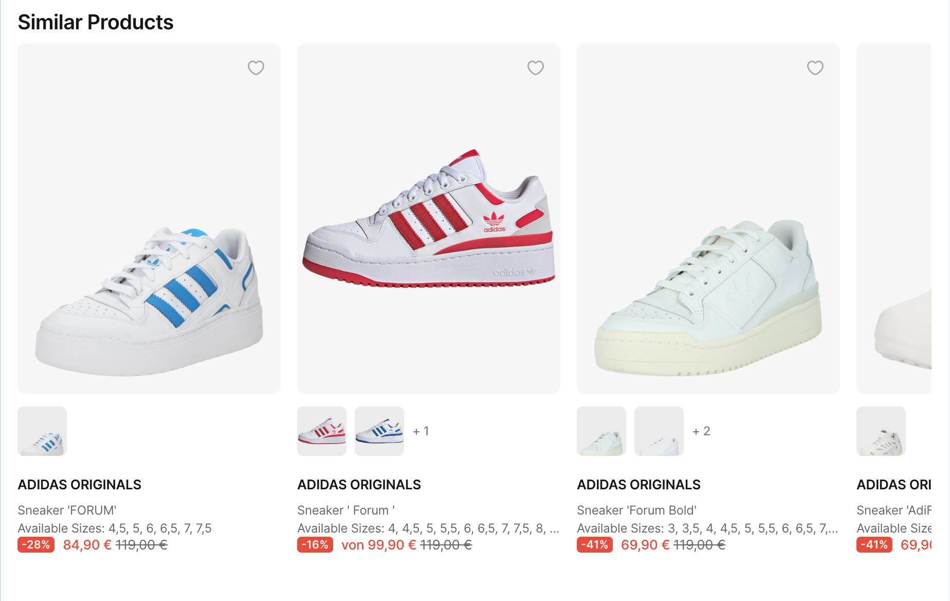
Similar Products Recommendation
The "Similar Products Recommendation" feature enhances the shopping experience by suggesting items related to the current product. This feature can increase conversion rates, improve user retention, and boost the average order value by presenting users with alternatives based on category and color, especially when the desired size is unavailable.
Use Case
This feature recommends products that share the same primary category and color as the main product on the PDP, helping users explore alternatives.
Technical Overview
To implement this feature, we will create a new component. Here’s how:
- Create the Component
Create a.vuefile in thecomponents/productfolder, naming itSimilarProductsRecommendation.vue. - Define Inputs
Define aproductprop to pass the current product to the component. - Get Product Information
Use theuseProductBaseInfocomposable to get the primary category and color. - Fetch Similar Products
Use theuseProductscomposable to fetch products with matching category and color. - Render the Products
Display the recommended products using theSFItemsSlidercomponent.
Outcome
The final implementation will show a slider of similar products based on the current product’s category and color, providing users with alternative options that may meet their needs.
Similar Products Recommendation


