

Storyblok
Overview
Storyblok is a leading headless CMS known for its powerful Visual Editor and component-based structure. The SCAYLE Storefront Application includes a default, high-quality integration that provides various helpers and a pre-built component library to quickly introduce custom content into your shop.
The integration uses the @storyblok/nuxt module, offering a smooth workflow from content creation to deployment. You get full control over your content with instant visual feedback and a flexible component system.
Key Features
- Visual Editor: Preview your local development environment directly within the Storyblok Visual Editor for a true What-You-See-Is-What-You-Get experience.
- Component Flexibility: Use a comprehensive set of pre-built base components or create custom components tailored to your needs.
- Automatic Rendering: The
StoryblokComponentautomatically renders the appropriate Vue component based on your content structure. - Multi-Language Support: Built-in folder-based internationalization with automatic slug resolution across different routing modes.
- Type Safety: Full TypeScript support with generated types for your content models.
Quick Links
Getting Started
Prerequisites
Before setting up Storyblok, ensure you have the following:
- Storyblok account: Sign up at storyblok.com.
- Storyblok space: Create a new space for your new Storefront Application project.
- Access tokens:
- Public/Delivery Token: Used to fetch content during runtime, see Access Token.
- Personal Access Token: Used to generate local types and import the content model during setup, see Personal Access Token.
Setup Your Storyblok Storefront
The Storyblok integration is included with the Storefront Application. To enable and configure it:
Step 1: Run Setup Command
Run the SCAYLE Storefront CLI setup cms storyblok command:
This command prompts you to:
- Provide your Storyblok space ID.
- Provide an access token.
- Provide a personal access token.
- Specify whether to import the content model.
Importing the content model is only intended for empty CMS spaces. Running it on spaces with existing content may cause issues.
Step 2: Review Configuration
After running the setup command, your nuxt.config.ts will include:
export default defineNuxtConfig({
  cms: {
    provider: 'storyblok'
  },
  runtimeConfig: {
    public: {
      cms: {
        space: process.env.NUXT_PUBLIC_CMS_SPACE,
        accessToken: process.env.NUXT_PUBLIC_CMS_ACCESS_TOKEN,
      }
    }
  }
})
The following environment variables are updated in your local .env file:
CMS_PROVIDER(required during built-time)NUXT_PUBLIC_CMS_SPACE(required during runtime)NUXT_PUBLIC_CMS_ACCESS_TOKEN(required during runtime)NUXT_PUBLIC_CMS_ALLOW_DRAFTS(optional during runtime)STORYBLOK_PERSONAL_TOKEN(required for cli commands)
Step 3: Environment Configuration & Deployment
The @storyblok/nuxt module uses Nuxt's RuntimeConfig, which provides flexibility for different deployment environments.
Runtime vs Build-Time Configuration
Unlike traditional build-time configuration, environment variables can be set at runtime. This means:
- During development: Set variables in your
.envfile. - During deployment: Update environment variables on your hosting platform without rebuilding.
- Different environments: Use the same build for development, staging, and production with different variables.
Environment Variables Reference
All Storyblok configuration settings can be set via environment variables:
Production Deployment Checklist
- Use Public/Delivery token in production (not Preview token)
- Optionally set
NUXT_PUBLIC_CMS_ALLOW_DRAFTS=falsein production - Use Preview token only in development/staging environments
- Ensure all required environment variables are configured on your hosting platform
- Test content loading in your production environment before going live
Architecture & Integration
Storyblok uses a component-based architecture where content is built from reusable blocks called "components" or "blocks". Each Storyblok component maps to a Vue component in your application, enabling a seamless bridge between your CMS and the Storefront Application.
Component Mapping Pattern
- Storyblok component
Text→ Vue componentTextComponent.vue - Storyblok component
Image→ Vue componentImageComponent.vue - Storyblok component
Section→ Vue componentSectionComponent.vue - Storyblok component
ProductListingPage→ Vue componentProductListingPageComponent.vue
Content Organization Architecture
The Storyblok integration uses a folder-based approach for organizing content across multiple languages and shops. Understanding the folder structure and naming conventions is essential for proper routing and content resolution.
Folder Naming Conventions
See #create-locale-folders for a folder structure example.
- Use shop codes: Folder names must match the
codefield in your shop configuration (e.g.,de,en,ch).- Use the shop
code, NOT the full locale (e.g.,de, notde-DE). - Shop
codeis used for URL routing (e.g.,de,at,de-en). - Full locale is the BCP-47 code (e.g.,
de-DE,de-AT,en-DE).
- Use the shop
- Homepage: Each locale folder must contain a
homepagestory for the root path (/). - Categories folder: Create a folder with slug
cinside each locale folder for Product Listing Page (PLP) CMS content.- Category pages use the pattern
c-{categoryId}(e.g.,c-91825for category ID 91825). - The application automatically constructs the slug as
c/c-{categoryId}when fetching category content.
- Category pages use the pattern
- Content folder: Create a folder with slug
contentinside each locale folder for general CMS pages (except homepage).- All content pages (about, privacy, etc.) go inside this folder.
- The application automatically prepends
content/to the page slug when fetching.
- Consistent structure: Maintain the same folder structure across all locales for easier management.
- Path mirroring: The path structure inside each locale folder mirrors your application's URL structure.
Routing Mode Integration
The Storyblok integration automatically handles slug resolution based on your Storefront Application's routing configuration. The routing mode is configured via the SHOP_SELECTOR_MODE environment variable.
All content uses a folder-based approach with locale prefixes, regardless of which routing mode you use. This provides consistency and simplifies content management.
Path-Based Routing
Configuration: SHOP_SELECTOR_MODE=path
In path-based routing, each shop has its own URL prefix:
| URL | Storyblok Slug |
|---|---|
/de/ | de/homepage |
/de/content/about | de/content/about |
/de/content/privacy | de/content/privacy |
/de/c/category-slug-91825 (Category) | de/c/c-91825 |
/en/content/about | en/content/about |
/ch/c/category-slug-139 (Category) | ch/c/c-139 |
The integration automatically removes the shop prefix from the URL path before constructing the Storyblok slug.
Domain-Based Routing
Configuration: SHOP_SELECTOR_MODE=domain
In domain-based routing, each shop uses a different domain or subdomain:
| URL | Storyblok Slug |
|---|---|
de.example.com/ | de/homepage |
de.example.com/content/about | de/content/about |
de.example.com/content/privacy | de/content/privacy |
de.example.com/c/category-slug-91825 (Category) | de/c/c-91825 |
en.example.com/content/about | en/content/about |
ch.example.com/c/category-slug-139 (Category) | ch/c/c-139 |
The integration determines the locale from the domain and prepends it to the path.
Path-Except-Default Routing
Configuration: SHOP_SELECTOR_MODE=path_or_default
In path-except-default routing, the default shop has no URL prefix, while other shops do:
Assuming de is the default shop:
| URL | Storyblok Slug |
|---|---|
/ (default locale) | de/homepage |
/content/about (default locale) | de/content/about |
/content/privacy (default locale) | de/content/privacy |
/c/category-slug-91825 (Category, default) | de/c/c-91825 |
/en/content/about | en/content/about |
/en/ | en/homepage |
/ch/c/category-slug-139 (Category) | ch/c/c-139 |
The integration automatically detects the current locale and constructs the appropriate Storyblok slug.
Multiple Shops with Same Language
You can have multiple shops sharing the same language but with different content:
Example: German shops for different countries:
- Shop 1 (Germany):
locale: 'de-DE',code: 'de'→ Storyblok folderde/, - Shop 2 (Austria):
locale: 'de-AT',code: 'at'→ Storyblok folderat/, - Shop 3 (Switzerland):
locale: 'de-CH',code: 'ch'→ Storyblok folderch/.
Each shop gets its own Storyblok folder based on its unique code, allowing completely different content even when using the same language. This is useful for:
- Country-specific campaigns and promotions,
- Different product catalogs per country,
- Region-specific legal content,
- Localized imagery and messaging.
Sharing Content Across Shops
If you want multiple shops to use the same content from a single Storyblok folder, use the folderMapping configuration to map different shop codes to the same folder:
With this configuration:
- All three shops (
de,at,ch) fetch content from the samede/folder in Storyblok. - You only need to maintain one set of content for all German-speaking markets.
- Reduces content duplication and maintenance effort.
- Perfect for markets with minimal regional differences.
Use cases for shared content:
- Testing new markets before creating localized content.
- Small markets that don't require region-specific content.
- Consistent brand messaging across similar regions.
- Reducing initial content creation effort.
Content Fetching Flow
When a user visits your Storefront Application, the integration follows this flow:
- Route resolves: User navigates to a URL (e.g.,
/en/content/about). - Slug resolution: The integration resolves the route to a Storyblok slug (e.g.,
en/content/about). - API request: Content is fetched from the Storyblok API.
- Component mapping: Storyblok components are mapped to corresponding Vue components.
- Rendering: Vue components render the content with proper styling and interactivity.
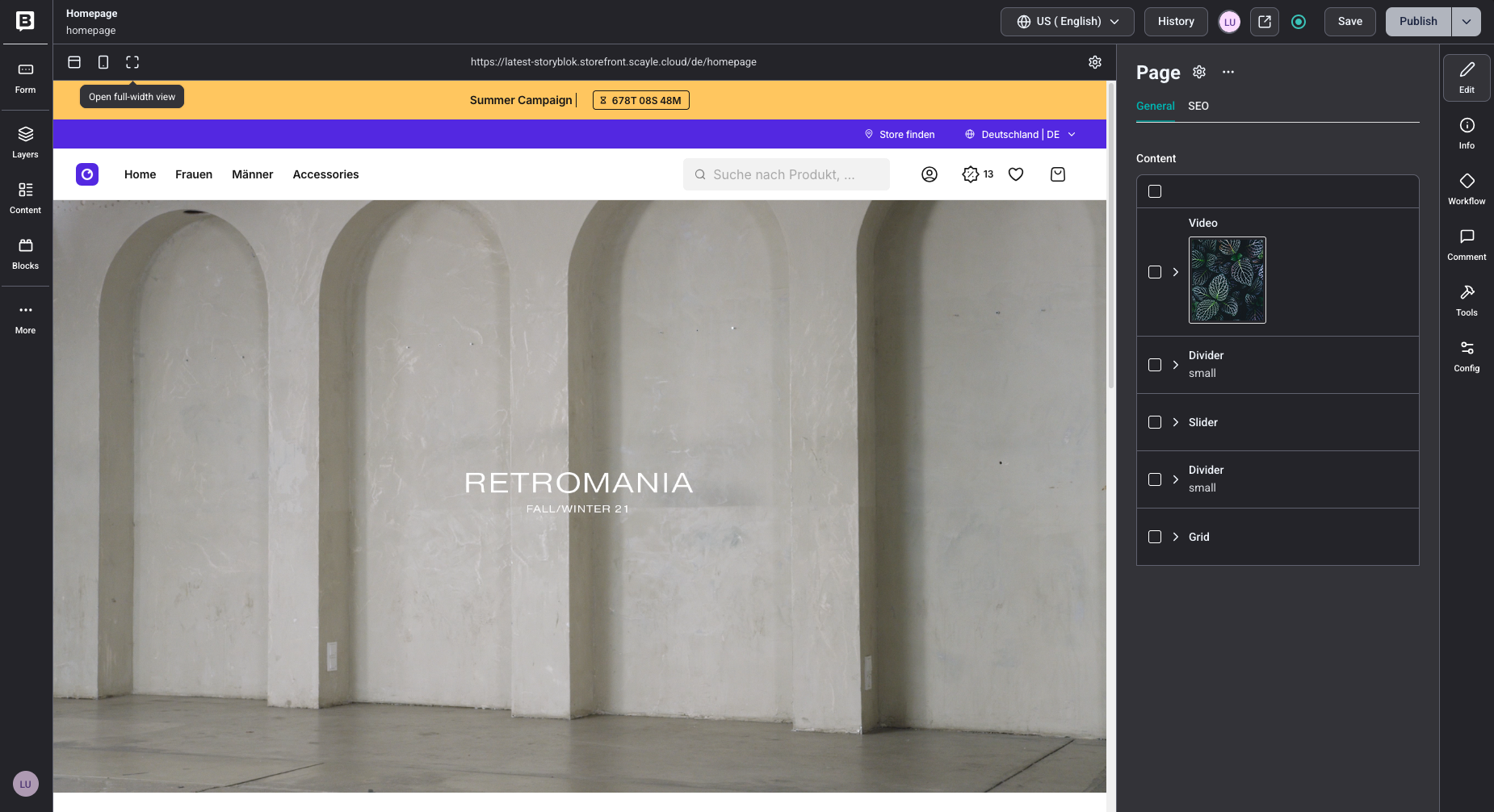
Visual Editor Integration
The Storyblok Visual Editor enables you to see changes in real-time as you edit content in Storyblok:
- Editor detection: The integration detects the
_storyblokquery parameter in the URL. - Draft content: Draft versions are loaded instead of published versions.
- Live updates: Changes in Storyblok appear instantly in the preview browser.
- Deep reactivity: Component updates trigger Vue re-renders automatically.
Storyblok Preview
Configure Preview Access
To display unpublished changes on initial load in the Storyblok editor, your access token must have the Preview access level. If your token has a different access level, unpublished changes appear only after modifications are made in the editor.
Ensure each component applies the v-editable directive to its root element for full Visual Editor functionality.
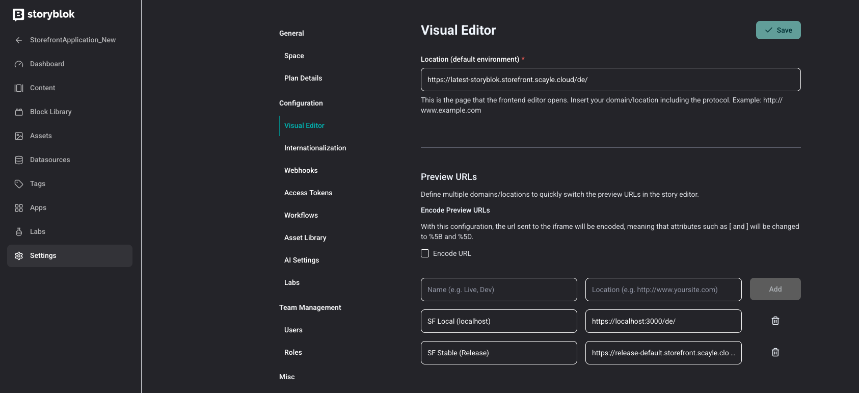
Configure the Visual Editor Base URL
To set up the Visual Editor, configure the base URL under the Space "Settings" page in Storyblok:
- Go to your Storyblok space "Settings".
- Find the preview configuration section.
- Enter your development environment URL (e.g.,
http://localhost:3000for local development). - For shops using path prefixes, include them in the URL.
- For shops with separate domains, enter the full domain.
Storyblok automatically appends the page slug to this URL, ensuring the correct page displays in the editor.
Enable Draft Content
Set the following environment variable to display draft content:
Visual Editor Support
Use the v-editable directive to enable click-to-edit functionality in the Storyblok Visual Editor:
The v-editable directive tells Storyblok which elements are editable, enabling content editors to click directly on content in the preview.
Test Live Preview
- Open a story in Storyblok.
- Click the "Open in Visual Editor" button.
- Verify the preview loads correctly.
- Make changes in Storyblok and verify they appear instantly.
Embedding CMS Content in Existing Pages
You can enrich existing Storefront Application pages with CMS-managed sections without converting the entire page to CMS. For example, the Product Listing Page (PLP) demonstrates this pattern:
This pattern lets you drop CMS-controlled blocks into any page region while keeping core page logic in your application.
Available Components
The integration provides pre-built components organized by function. These components serve as building blocks for your content. You can explore all components in our UI Component Overview.
Core Content Primitives
| Component | Description |
|---|---|
TextComponent | Text content with flexible heading levels (h1-h4) and paragraphs. |
LinkComponent | Navigable text and image links with proper URL resolution. |
ImageComponent | Optimized images with responsive sizing and aspect ratio. |
VideoComponent | Embed videos with customizable playback controls. |
Interactive & Basic Content Blocks
| Component | Description |
|---|---|
AccordionComponent | Collapsible accordion sections. |
AccordionItemComponent | Individual accordion items with expand/collapse functionality. |
ButtonComponent | Action buttons with configurable styling and link destinations. |
Layout & Structural
| Component | Description |
|---|---|
PageComponent | Top-level page container for full-page content. |
ProductListingPageComponent | Specialized component for category page content. |
SectionComponent | Content container with background image/color support. |
GridComponent | Multi-column layout system for content organization. |
DividerComponent | Visual spacing and divider elements. |
Rich Content
| Component | Description |
|---|---|
RichTextComponent | Storyblok rich text with proper formatting and link resolution. |
E-Commerce Specific
Please be aware that the included ProductSliderComponent requires the official SCAYLE Field Type Plugin for Storyblok to be setup and configured. Please reach out to your SCAYLE representative for more information.
| Component | Description |
|---|---|
SliderComponent | Carousel for multiple content items. |
ProductSliderComponent | Product carousel with selectable products. |
RecentlyViewedProductsComponent | Recently viewed products. |
SmartSortingProductsSliderComponent | Configurable product slider that accepts a Smart Sorting Key and additional parameters. |
Guidelines: Content
Create Locale Folders
Organize your content in Storyblok using folders that match your shop codes:
- Create a folder for each language or shop (e.g.,
de/,en/,ch/) - Inside each language folder, create three subfolders:
homepage- Your homepage story,c/- Category page content (named asc-{categoryId}),content/- General content pages (about, privacy, terms, etc.).
- Place your stories in the appropriate folder.
- Maintain the same structure across all language folders for consistency.
Using Base Components
The included pre-built components provide all the building blocks needed to create common e-commerce content patterns. Compose flexible sections that adapt to your brand and merchandising needs.
Composing E-Commerce Blocks
Hero Banner
Combine these components to create an impactful hero banner:
- Use
SectionComponentwith a background image. - Add
TextComponentfor the headline and description. - Include one or more
ButtonComponentinstances for calls-to-action. - Use
DividerComponentfor vertical spacing.

Structure
Category Teasers / Cards
Create a card grid layout:
- Use
GridComponentwith four columns on desktop, two on mobile. - Inside each column, add
SectionComponentwith a background image. - Include
ButtonComponentto link to the category page.
Structure
Promotional Slider
Implement a carousel pattern:
- Use
SliderComponentas the container. - For each slide, use
SectionComponentas a container. - Add
TextComponentfor each slide title. - Add
DividerComponentas a separator. - Include
ButtonComponentto drive users to listings or campaigns.
Structure
Split Image & Text Section
Create a side-by-side layout:
- Use
GridComponentwith two columns on desktop, one on mobile. - First column:
SectionComponentwith a background image. - Second column:
TextComponentfor headline/description andButtonComponentfor CTA.
Structure
Creating Content for PLP
The Product Listing Page (PLP) is a main discovery point in the user journey. Our specialized component allows you to seamlessly inject custom, commerce-relevant content before and after your product stream.
Follow these steps to set up content for a specific category:
Step 1: Create the PLP Content Entry
- In your Storyblok, navigate to the Categories folder.
- Click Create new content → Story.
- Define the Name for your content.
- Crucially, set the Slug to match the relative URL path of your target category (e.g.,
c-50341). - In the Content Type field, choose
Product Listing Page Component.
Step 2: Configure the PLP Component in Preview
- Enter Preview Mode. You will see your category page rendered with two configurable areas on the right side:
- Teaser: Content displayed above the product stream (e.g., hero banners).
- SEO Content: Content displayed below the product stream.
- Let's start by clicking into the Teaser property.
Step 3: Design the Header Teaser (Background Images)
- For the Teaser, let's choose a
SectionComponent. - Add Background Images: Set the background images for both desktop and mobile. We strongly recommend using a different, smaller image size for mobile to optimize page layout and performance.
Step 4: Design the Header Teaser (Dimensions)
- Define Dimensions: Set the component height: e.g.,
300pxfor desktop and200pxfor mobile. - You can keep the default vertical and horizontal alignment as
centerandmiddle.
Step 5: Design the Header Teaser (Content)
- Add Content: Inside the section, add a
TextComponentwith the type set toHeading 1and define your desired value (e.g., "New Arrivals – Discover Now").
Step 6: Create the SEO Content
- Click into the SEO Content property.
- Choose a
Rich Text Component. This component allows you to format text and easily highlight key terms, which is crucial for SEO value.
Congratulations! Your customized PLP content is now ready to go live.
Guidelines: Development
Customizing Existing Components
You can customize existing components by modifying their Vue implementations to match your design system and requirements.
How Component Customization Works
All Storyblok components are rendered through the StoryblokComponent registry. To customize a component:
- Locate the component in
modules/cms/providers/storyblok/components/. - Modify the Vue component to match your design system.
- Test in Live Preview to verify your changes.
Available Components to Customize
The integration provides a comprehensive set of pre-built components that can be customized:
TextComponent.vue- Customize text rendering and stylingImageComponent.vue- Customize image display and responsivenessButtonComponent.vue- Customize button appearance and interactionsSectionComponent.vue- Customize layout and spacingGridComponent.vue- Customize grid columns and gapsLinkComponent.vue- Customize link styling and behavior- ... and all other available components.
Each component is registered in the StoryblokComponent (see the "Nested Components" section for details on how this registry works).
To customize any component, navigate to modules/cms/providers/storyblok/components/ and modify the Vue implementation to match your brand and design requirements.
Nested Components
Storyblok content types can reference other content types, creating nested component hierarchies. The ContentfulComponent serves as the central registry that maps all Contentful content types to their corresponding Vue components.
How StoryblokComponent Works:
The StoryblokComponent is a dynamic component dispatcher that:
- Receives a Storyblok content element (blok) as a prop
- Examines the element's component type
- Renders the appropriate Vue component based on the component type
- Passes the element data to the mapped component
This allows you to build deeply nested content structures where any content type can contain references to other content types, and they'll all render correctly without needing to know about each other.
Example - Nested Content:
Components can contain other components via reference fields:
The StoryblokComponent Registry:
Under the hood, StoryblokComponent.vue contains a series of conditional branches that determine which Vue component to render:
Benefits of This Pattern:
- Flexibility: Build complex content hierarchies with any combination of bloks.
- Reusability: Components don't need to know about each other, just about
StoryblokComponent. - Maintainability: Add new components to one central place (the registry).
- Visual Editor Support: The
v-editabledirective enables click-to-edit for all nested components. - Fallback Handling: Unknown component types display a helpful message instead of breaking.
Building New Components
Creating new Storyblok components allows you to extend the pre-built library with custom functionality.
Step 1: Define in Storyblok
- Go to your Storyblok space → "Components".
- Click "Create new component".
- Define the component structure with appropriate fields (text, images, references, etc.).
- Publish the component schema.
Step 2: Add TypeScript Types
After defining your component in Storyblok, types are automatically generated by running the cms:sync command from your Storefront Application root directory:
This command:
- Logs into Storyblok using your
STORYBLOK_PERSONAL_TOKEN. - Pulls components from your Storyblok space.
- Generates TypeScript types automatically from your component schema.
- Organizes types in
modules/cms/providers/storyblok/types/gen/.
What Gets Generated
The cms:sync command generates:
- Component interfaces: Full TypeScript definitions for all Storyblok components.
- Type files: Organized in
modules/cms/providers/storyblok/types/gen/components/. - Type guards: Ready-to-use type checking utilities (e.g.,
isTypeMyBannerComponent).
Generated Type Example
After running pnpm cms:sync, your component types are automatically available:
Import Generated Types
Use the auto-generated types in your Vue components:
Never manually edit files in modules/cms/providers/storyblok/types/gen/. These are auto-generated and will be overwritten when you run pnpm cms:sync again.
Step 2: Create Vue Component
Create a corresponding Vue component in your application. Components receive a contentElement prop containing the Storyblok data:
Step 4: Register Component
Register the component in StoryblokComponent.vue to make it renderable:
Best Practices
Content Organization
- Mirror URL structure: Keep the same folder structure in all locale folders.
- Consistent naming: Use the same story slugs across locales when possible.
- Shared assets: Store locale-independent assets (images, videos) separately and reference them.
Translation Workflow
- Create default locale first: Start with one locale as the source of truth.
- Use translation workflows: Leverage Storyblok's translation features.
- Review process: Implement a review process for translated content.
Performance
- Use caching: The Storefront Application caches Storyblok responses.
- Lazy loading: Use
lazy: truefor below-the-fold content. - Asset optimization: Use Storyblok's image service for optimized delivery.
SEO Considerations
- Unique meta tags: Ensure each locale has unique meta titles and descriptions.
- Hreflang tags: Implement hreflang tags for multilingual SEO.
- Canonical URLs: Set canonical URLs appropriately for each locale.
- Sitemap: Generate locale-specific sitemaps.
Development Workflow
- Use Live Preview: Enable Live Preview for content editors during development.
- Sync types regularly: Run
pnpm cms:syncafter content model changes. - Test with draft content: Verify draft content displays correctly before publishing.
- Handle errors gracefully: Implement proper error boundaries and fallbacks.
- Test across routing modes: Verify content fetching works correctly with your specific routing mode (path-based, domain-based, or path-except-default)
Troubleshooting
Content Not Found (404)
Problem
Content exists in Storyblok but shows 404 in the application.
Solutions
- Ensure content is in the correct locale folder.
- Confirm the locale code matches your i18n configuration.
- Verify the story slug matches the URL path.
- If using custom
folderMapping, ensure it's correct.
Debugging
Preview Not Working
Problem
Visual Editor preview doesn't load or shows errors.
Solutions
- Verify the preview URL matches your routing mode.
- Ensure you're using a preview access token.
- Set
NUXT_PUBLIC_CMS_ALLOW_DRAFTS=truefor preview. - Verify CORS is configured correctly in your application.
Debugging
- Open browser DevTools and check for network errors.
- Verify the
_storyblokquery parameter is present in the URL. - Check the console for warning messages.
Wrong Content Loaded
Problem
Content from wrong locale is displayed.
Solutions
- Verify
i18n.locale.valueis correct. - Ensure your routing mode is configured correctly.
- If page cache is used, clear page cache if content is cached incorrectly.
Debugging
Slug Mismatch
Problem
Slug resolution doesn't match the expected Storyblok path.
Solutions
- Verify the shop prefix is being removed correctly.
- If using
folderMapping, ensure configuration is correct. - Use the
resolveStoryblokSlugutility directly to test.

