

SCAYLE Panel UI
The SCAYLE Panel provides a structured and intuitive interface for managing all aspects of your shop configuration. This page gives you a high-level overview of the panel layout and explains the different navigation and content areas available once you are signed in.
A separate guide is available for the Dashboard, which is the default landing page after login.
Layout Overview
The panel layout consists of three main interface sections:
Header

The header is fixed at the top of the panel and includes:
- The SCAYLE logo
- Main navigation menu with top-level sections: Shops, Products, Settings, and Add-Ons
- A global search bar
- Notification center
- Help access
- User profile menu
Global Search
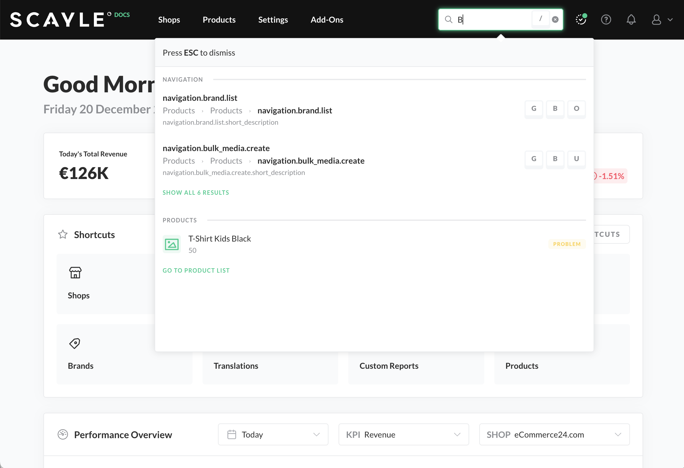
Global Search
To use the search field for navigation, just enter any term in the search field on the top right of the navigation bar. You will then see matching pages. The search field automatically suggests recently used search terms. Click on a term to repeat the previous search query.
You can use the global search to access the following areas:
- Regular pages
- Specific product IDs and product names
- Shops and merchants
- User manual pages
To close the search field, press the ESC key.
Sidebar Navigation

The sidebar appears on the left side of the panel and adapts based on the top-level section selected in the main navigation (e.g., Shops, Products, Settings, Add-Ons).
Each area has its own contextual sidebar to support the specific workflows relevant to that section.
Navigation items are grouped logically and may be collapsed or expanded.
Shop Sidebar Navigation

When "Shops" is selected in the main navigation, the sidebar allows you to:
- Navigate across your available shops
- Switch between countries configured within each shop
- Access features such as Orders, Customers, Products, and more depending on the selected shop context
The shop and country switcher at the top of the sidebar helps you quickly switch between different configurations and data sets.
Main Content Area

The main area of the interface displays the content for the selected section. This can include tables, forms, settings, detail views, and actions related to the selected module.
Each section is designed with consistent page structures that include:
- Page title and breadcrumbs
- Action buttons (e.g., “Add New”)
- Filters and search tools (where applicable)
- Data tables or forms
Overwrite Selector

This Overwrite Selector element allows users to define the scope of checkout-related settings. You can choose whether the settings should apply at the company level (e.g. Acme Corp.) or be overwritten per country shop, such as Germany, Austria, or .... This ensures that configuration can be tailored based on the specific market requirements of each country shop.


