

Contentstack
Overview
Contentstack is a highly scalable, API-first headless CMS platform designed for large volumes of complex, structured content. The SCAYLE Storefront Application includes a comprehensive, production-ready integration that leverages Contentstack's API and content modeling capabilities.
The integration manages API complexity, allowing your team to focus on building and deploying stunning content experiences. You get structured content with strong typing, flexible content modeling, and high-performance delivery.
Key Features
- Live Preview: Real-time content editing with instant preview updates.
- Type Safety: Automatic TypeScript type generation from Contentstack content models.
- Locale support: Native multi-language content with configurable fallback chains.
- Component-based architecture: Reusable content blocks mapped to Vue components.
Quick Links
- Contentstack Documentation
- Contentstack Language Setup
- Contentstack Create content types
- Contentsack Delivery SDK
- Contentstack Live Preview
Getting Started
Prerequisites
Before starting, ensure you have:
- Contentstack account: Sign up at contentstack.com.
- Contentstack stack: Create a new stack for your storefront.
- Access tokens:
- Delivery API token: For fetching published content in production, see Content Delivery API.
- Preview API token: For development and draft content access, see Preview API.
- Management API token: For content model setup and type generation, see Content Management API.
Setup Your Contentstack Storefront
The Contentstack integration is included with the Storefront Application. To enable and configure it:
Step 1: Run Setup Command
Run the SCAYLE Storefront CLI setup cms contentstack command:
This command prompts you to:
- Provide your Stack API key.
- Provide a Delivery API access token.
- Provide a Preview API access token.
- Provide the Region your stack is hosted in.
- Provide the environment you want to use.
- Provide a Management API access token.
- Specify whether to import the content model.
To specify the branch of the stack, you can use the --branch flag with the CLI command. By default the main branch is used.
Importing the content model is only intended for empty CMS spaces. Running it on spaces with existing content may cause issues.
Step 2: Review Configuration
After setup, your nuxt.config.ts will include:
The following environment variables are updated in your local .env file:
- CMS_PROVIDER (required during build time)
NUXT_PUBLIC_CMS_ACCESS_TOKEN(required during runtime)NUXT_PUBLIC_CMS_DELIVERY_ACCESS_TOKEN(required during runtime)NUXT_PUBLIC_CMS_PREVIEW_ACCESS_TOKEN(required during runtime)NUXT_PUBLIC_CMS_REGION(required during runtime)NUXT_PUBLIC_CMS_ENVIRONMENT(required during runtime)NUXT_PUBLIC_CMS_BRANCH(required during runtime)NUXT_PUBLIC_CMS_MANAGEMENT_TOKEN(required for cli commands)
Step 3: Environment Configuration & Deployment
The Contentstack integration leverages Nuxt's RuntimeConfig, which provides flexibility for different deployment environments.
Runtime vs Build-Time Configuration
Unlike traditional build-time configuration, environment variables can be set at runtime. This means:
- During development: Set variables in your
.envfile. - During deployment: Update environment variables on your hosting platform without rebuilding.
- Different environments: Use the same build for development, staging, and production with different variables.
Environment Variables Reference
All Contentstack configuration can be set via environment variables:
Production Deployment Checklist
- Use Delivery API token in production (not Preview token)
- Use Preview token only in development/staging environments
- Ensure all required environment variables are configured on your hosting platform
- Test content loading in your production environment before going live
Architecture & Integration
Shop Runtime Integration
The integration between Contentstack and the storefront application utilizes the @contentstack/delivery-sdk and @contentstack/live-preview-utils packages.
Additionally, @nuxt/image is employed to efficiently handle image loading, providing optimized images for diverse devices and improving overall performance.
How It Works
Contentstack operates on a content-type architecture, utilizing flexible, reusable content structures. Each content type in Contentstack corresponds to a Vue component within your application, facilitating a smooth integration between your CMS and Storefront.
Content Type Mapping Pattern:
- Contentstack content type
text-component→ Vue componentTextComponent.vue - Contentstack content type
image-component→ Vue componentImageComponent.vue - Contentstack content type
section-component→ Vue componentSectionComponent.vue - Contentstack content type
productlistingpage-component→ Vue componentProductListingPageComponent.vue
Content Organization Architecture
Homepage Setup
To ensure the storefront functions correctly, a Page with the URL /homepage is required. This setup is crucial for accurately mapping homepage content within your Storefront Application.
Language & Fallback Strategy
Contentstack enables seamless content localization without the need to duplicate entries for every language. By utilizing a fallback strategy, the system ensures that if content is missing in a specific locale, it automatically retrieves the version from a designated fallback language.
Create Languages
To set up localized content within your stack, follow these steps:
- Navigate to
Settings→Languages. - Click
+ New Languageto create locales that match all of your storefront codes (e.g.,de-de,en-us).When creating a custom language, ensure the language code is entirely lowercase (e.g., use
en-usinstead ofen-US) to ensure the integration functions correctly. - Define the Fallback Language to establish the resolution chain
Example Locale Setup:
| Target Locale | Language Name | Primary Fallback | |
de-de | German (Germany) | en-us | |
de-at | German (Austria) | de-de | |
de-ch | German (Switzerland) | de-de | |
en-us | English (US) |
The stack default language is used as the final fallback language. Setting the stacks default language is fixed at stack creation and cannot be modified later.
Content Fetching Flow
When a user visits your storefront, the integration follows this flow:
- Route resolves: User navigates to a URL.
- Query construction: The integration builds a Contentstack query with the slug and locale.
- Locale detection: Current shop locale is automatically included.
- API request: Content is fetched from Contentstack (Delivery or Preview API).
- Component mapping: Contentstack entries are mapped to Vue components.
- Rendering: Vue components render the content with proper styling.
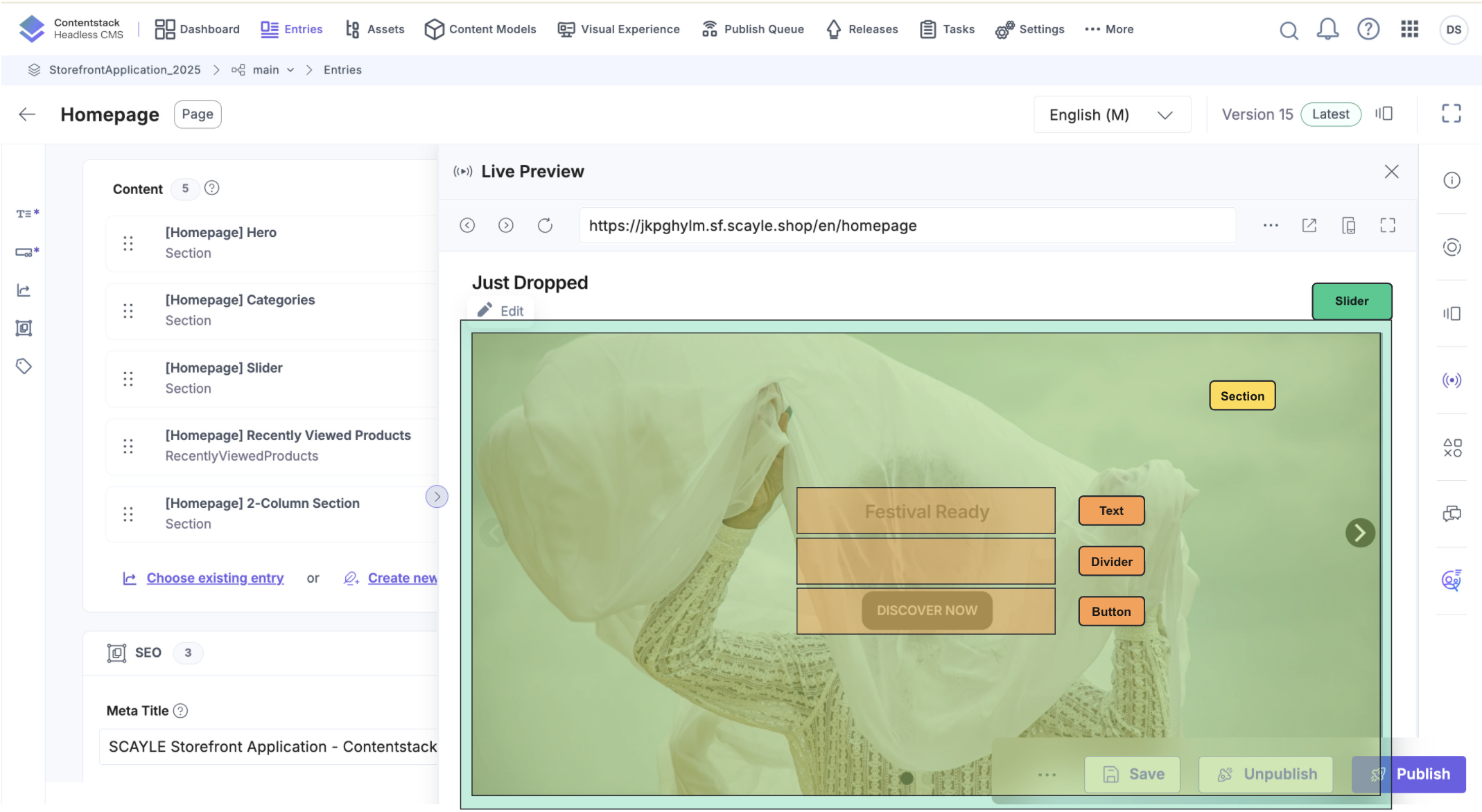
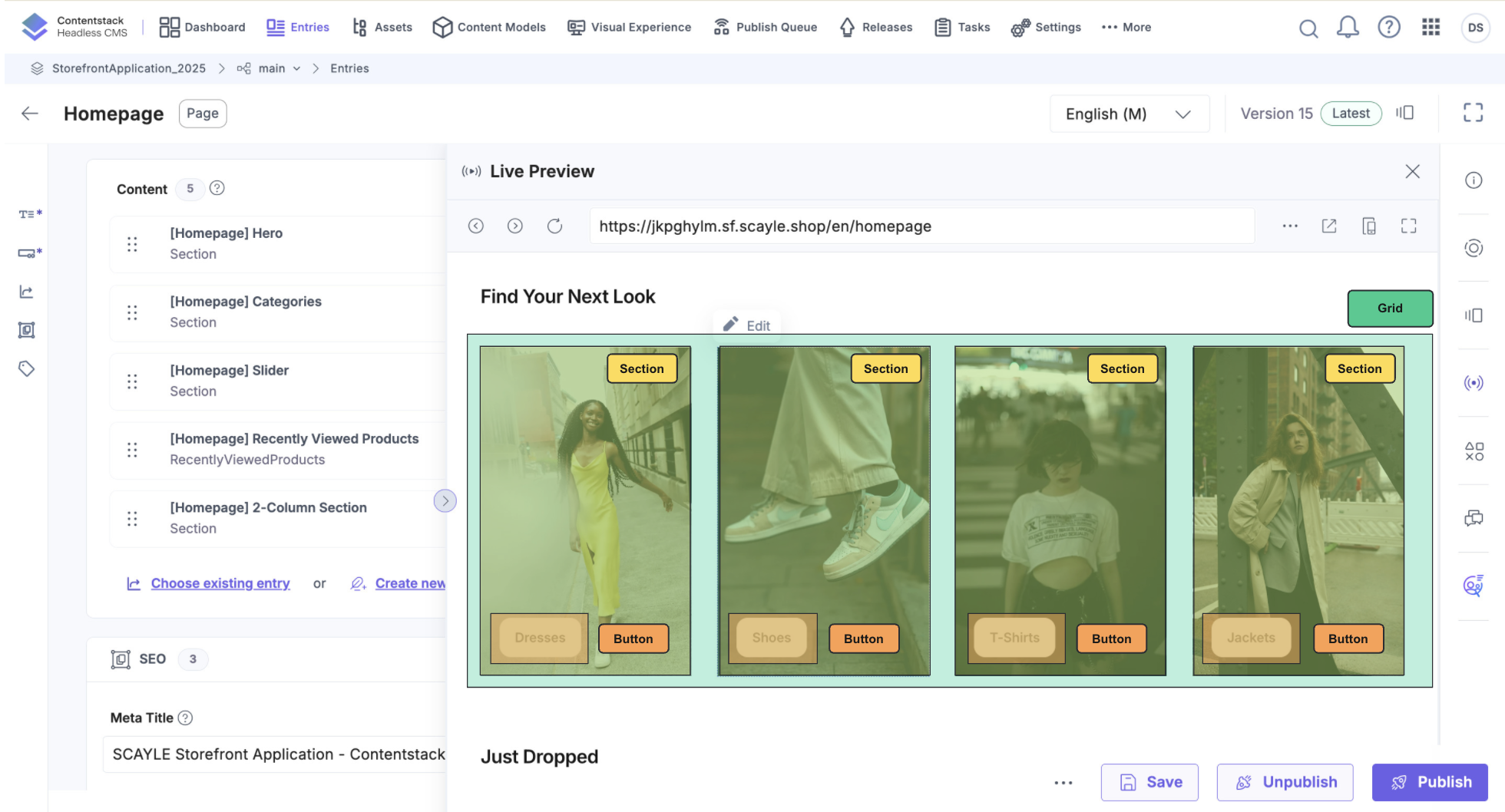
Live Preview Integration
Live Preview enables you to see changes in real-time as you edit content in Contentstack:
- Editor detection: The integration detects the
live_previewquery parameter orhttps://app.contentstack.com/as referer. - Preview API activation: Client switches to Preview API with preview access token.
- Draft content loading: Draft versions are loaded instead of published versions.
- Live updates: Changes in Contentstack appear instantly in the preview.
- Deep reactivity: Component updates trigger Vue re-renders automatically.
Configuring Preview Access
To display unpublished changes, you must have a Preview Token. When this token is not provided or has the wrong permissions, unpublished changes appear only after publishing in the editor.
Configuring Preview URLs in Contentstack
In Contentstack, configure a base URL for every language across each of your environments:
- Go to
Settings→Environments→ Edit an environment or create a new one. - Add a preview URL for each language.
Example preview URLs:
Visual Editor Support
Use the v-live-preview directive to enable click-to-edit functionality in Contentstack’s visual editor:
The v-live-preview directive in Contentstack marks editable elements by assigning custom HTML attributes to indicate their location within the content.
Test Live Preview
There are two ways to validate whether the live preview is working:
Entity Live preview
- Open a Page entity in Contentstack
- Click the live preview button within the right sidebar
- Verify the preview loads correctly
- Make a change and verify that the change does appear in the preview
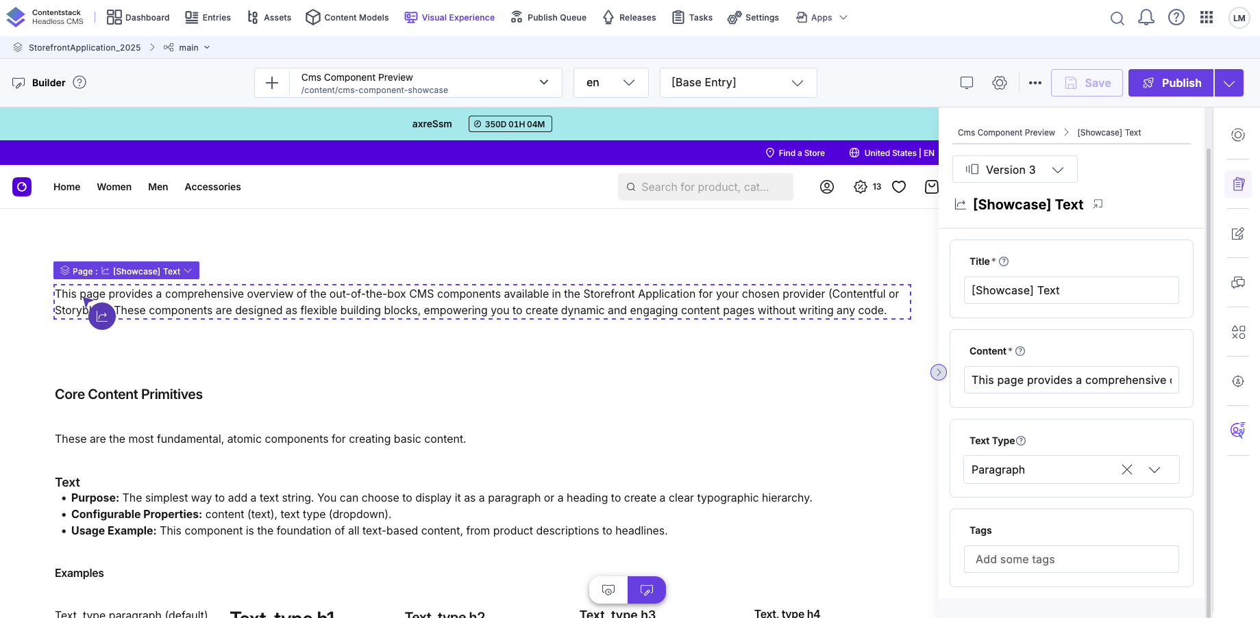
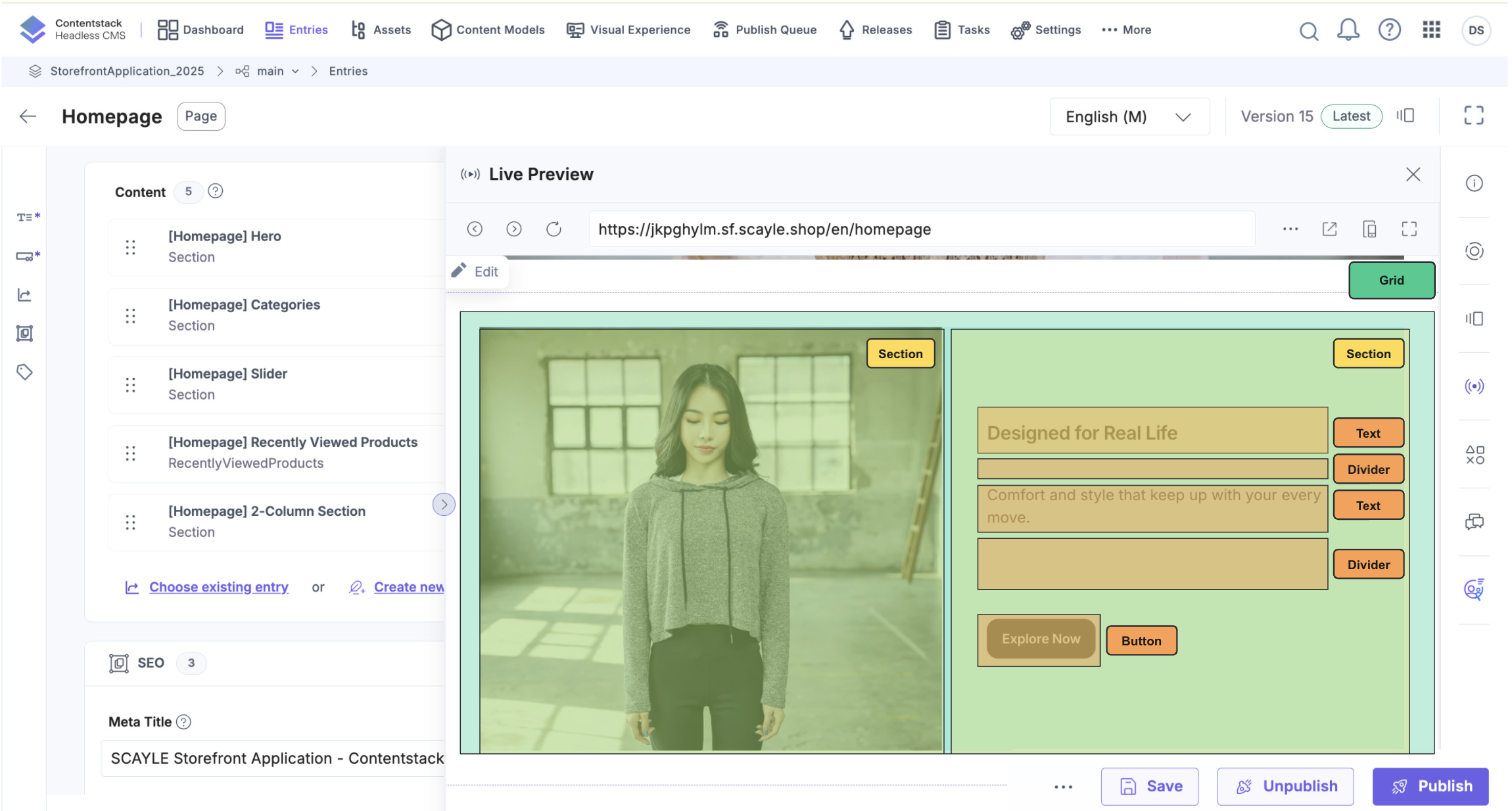
Visual Experience
- Open the "Visual Experience" in Contentstack and select a content entry.
- Verify the preview loads correctly.
- Verify Content elements are outlined in the preview when hovering them and controls appear after clicking on them.
- Make a change using the form in the right sidebar and verify the preview is updated accordingly.
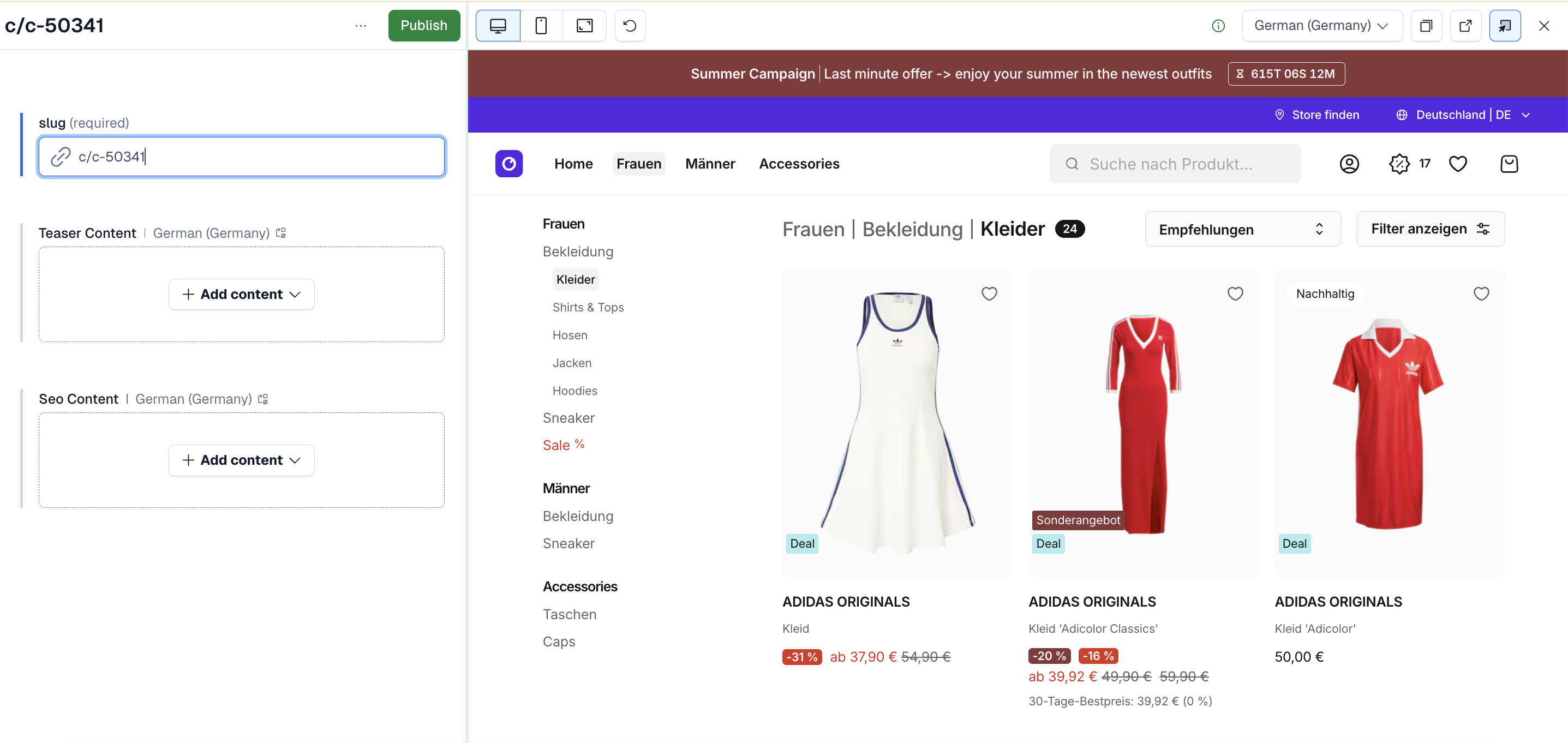
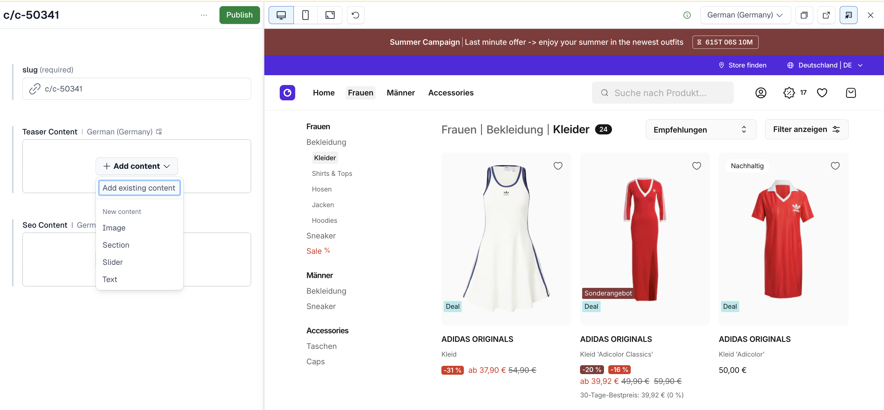
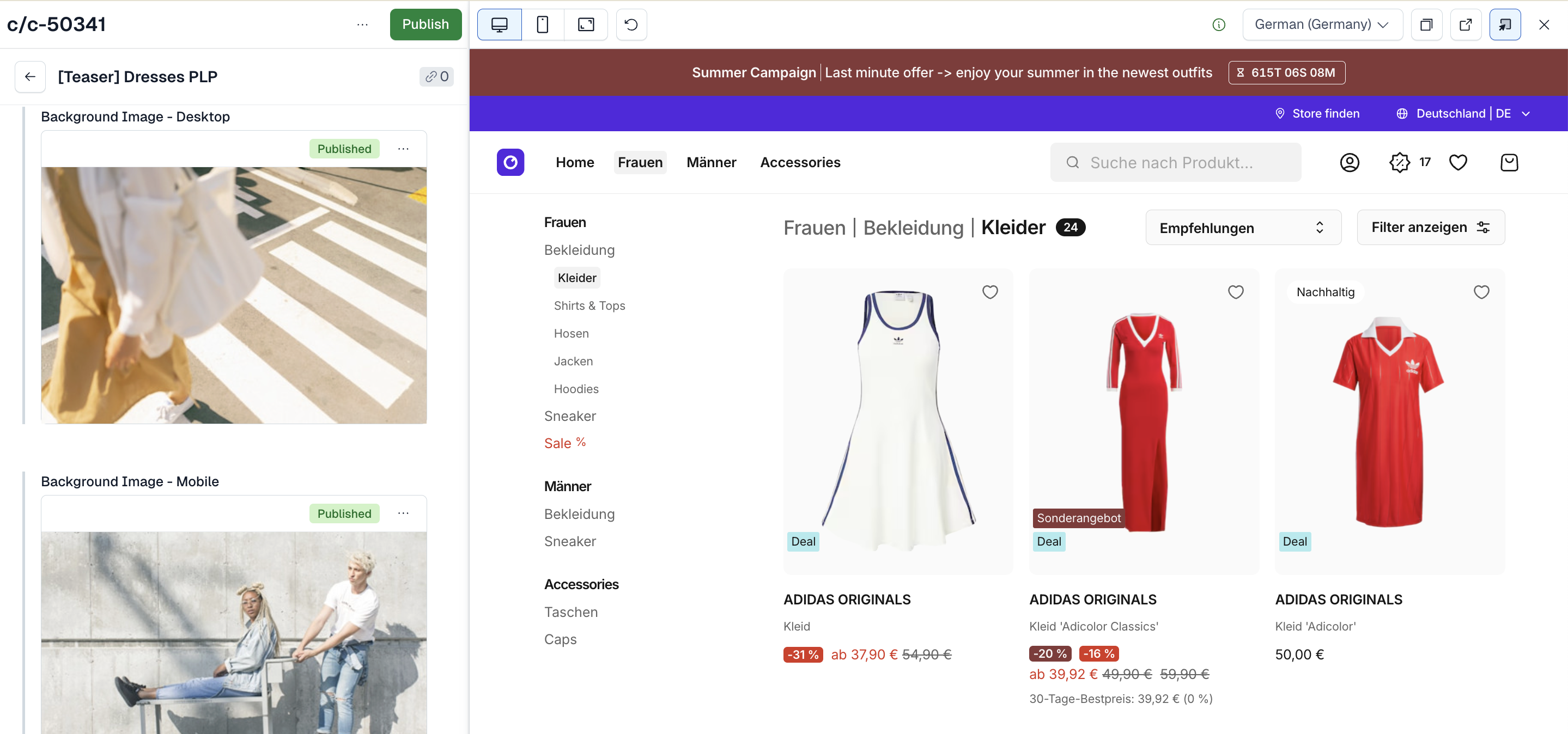
Embedding CMS Content in Existing Pages
You can extend existing Storefront Application pages with CMS content without converting the entire page to an CMS. For example, the Product Listing Page (PLP) demonstrates this pattern:
This pattern lets you drop CMS-controlled blocks into any page region while keeping core page logic in your application.
Available Components
The integration provides pre-built components organized by function. These components serve as building blocks for your content. You can explore all components in our UI Component Overview.
Core Content Primitives
| Component | Description |
|---|---|
TextComponent | Text content with flexible heading levels (h1-h4) and paragraphs. |
LinkComponent | Navigable text and image links with proper URL resolution. |
ImageComponent | Optimized images with responsive sizing and aspect ratio. |
VideoComponent | Embed videos with customizable playback controls. |
Interactive & Basic Content Blocks
| Component | Description |
|---|---|
AccordionComponent | Collapsible accordion sections. |
AccordionItemComponent | Individual accordion items with expand/collapse functionality. |
ButtonComponent | Action buttons with configurable styling and link destinations. |
Layout & Structural
| Component | Description |
|---|---|
PageComponent | Top-level page container for full-page content. |
ProductListingPageComponent | Specialized component for category page content. |
SectionComponent | Content container with background image/color support. |
GridComponent | Multi-column layout system for content organization. |
DividerComponent | Visual spacing and divider elements. |
Rich Content
| Component | Description |
|---|---|
RichTextComponent | Contentstack rich text with proper formatting and link resolution. |
E-Commerce Specific
| Component | Description |
|---|---|
SliderComponent | Carousel for multiple content items. |
RecentlyViewedProductsComponent | Recently viewed products. |
SmartSortingProductsSliderComponent | Configurable product slider that accepts a Smart Sorting Key and additional parameters. |
Guidelines: Content
Using Base Components
The included pre-built components provide all the building blocks needed to create common e-commerce content patterns. Compose flexible sections that adapt to your brand and merchandising needs.
Contentstack does not support nesting deeper than 5 levels. While the editor might allow creating nested items beyond this depth, the delivery API will not return such content.
Keep this limitation in mind when combining base components for more specific UI elements.
Hero Banner
Combine these components to create an impactful hero banner:
- Use
SectionComponentwith a background image. - Add
TextComponentfor the headline and description. - Include one or more
ButtonComponentinstances for calls-to-action. - Use
DividerComponentfor vertical spacing.

Structure
Category Teasers / Cards
Create a card grid layout:
- Use
GridComponentwith four columns on desktop, two on mobile. - Inside each column, add
SectionComponentwith a background image. - Include
ButtonComponentto link to the category page.
Structure
Promotional Slider
Implement a carousel pattern:
- Use
SliderComponentas the container. - For each slide use a
SectionComponentas container. - Add
TextComponentfor each slide title. - Add
DividerComponentas separator. - Include
ButtonComponentto drive users to listings or campaigns.
Structure
Split Image & Text Section
Create a side-by-side layout:
- Use
GridComponentwith two columns on desktop, one on mobile. - First column:
SectionComponentwith background image. - Second column:
TextComponentfor headline/description andButtonComponentfor CTA.
Structure
By combining these base primitives, you can build visually appealing, commerce-relevant sections without custom code.
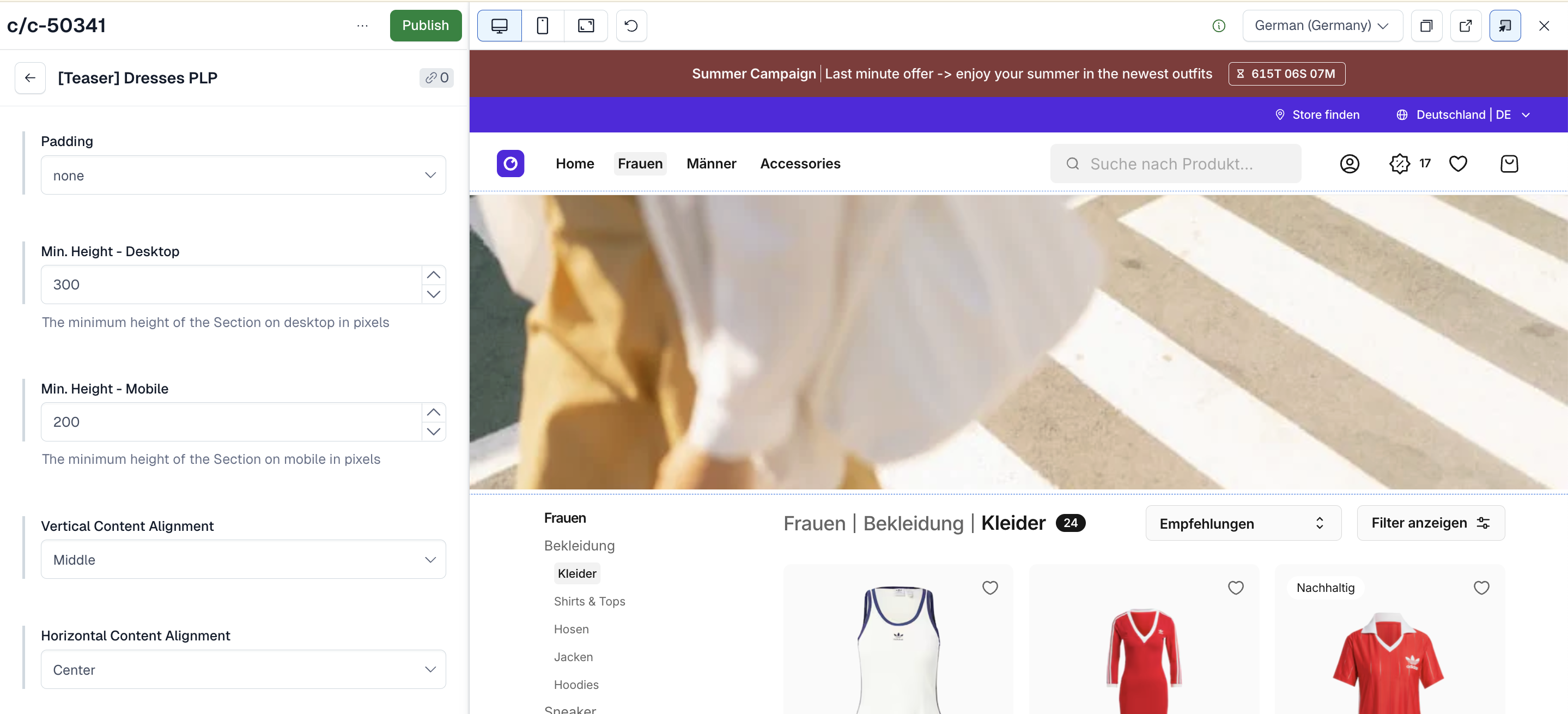
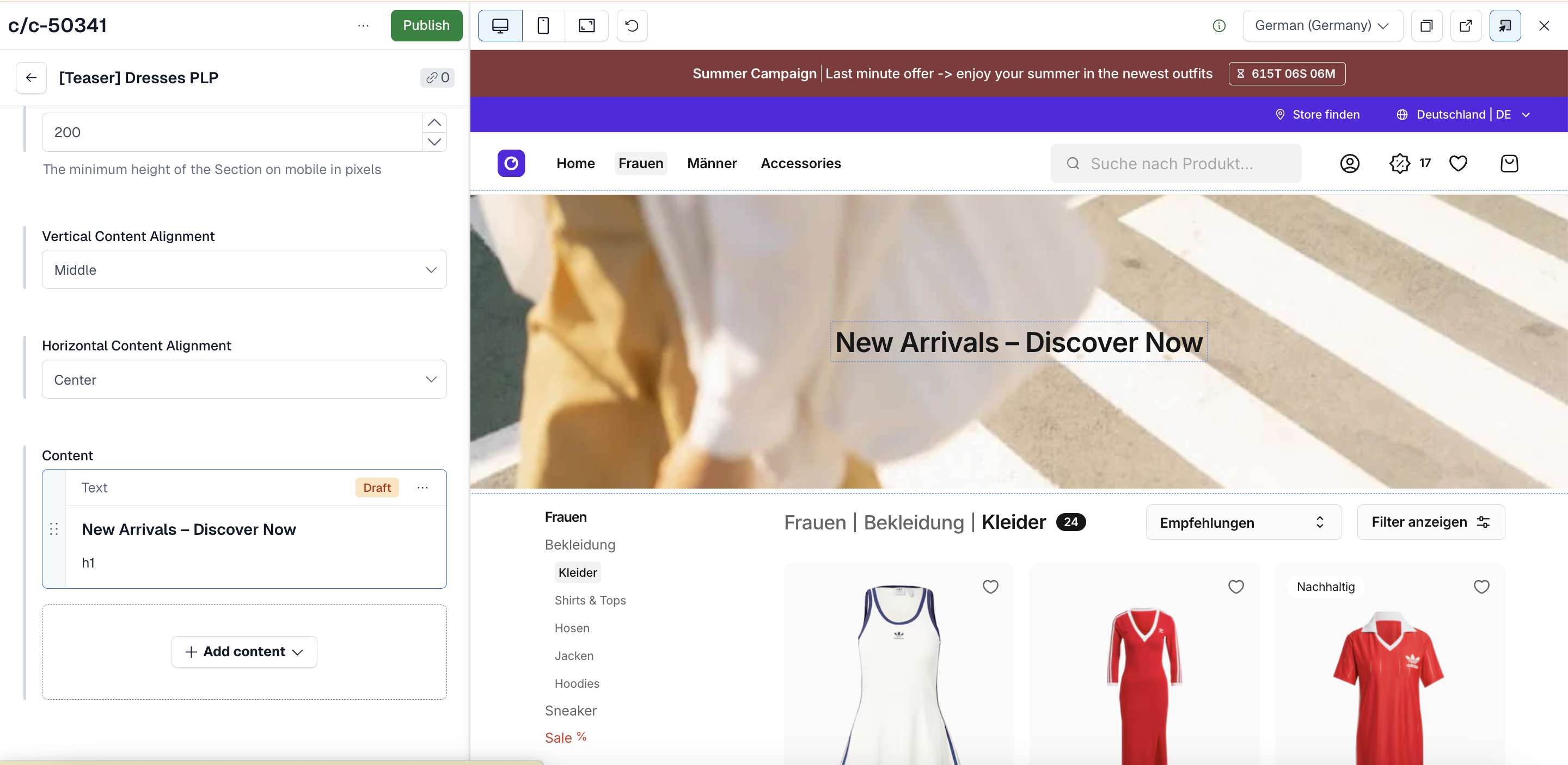
Creating Content for PLP
The Product Listing Page (PLP) is a main discovery point in the user journey. Our specialized component allows you to seamlessly inject custom, commerce-relevant content before and after your product stream.
Follow these steps to set up content for a specific category:
Congratulations! Your customized PLP content is now ready to go live.
Guidelines: Development
Customizing Existing Components
You can customize existing components by modifying their Vue implementations to match your design system and requirements.
How Component Customization Works
All Contentstack components are rendered through the ContentstackComponent registry. To customize a component:
- Locate the component in
modules/cms/providers/contentstack/components/. - Modify the Vue component to match your design system.
- Test in Live Preview to verify your changes.
Available Components to Customize
The integration provides a comprehensive set of pre-built components that can be customized:
TextComponent.vue- Customize text rendering and stylingImageComponent.vue- Customize image display and responsivenessButtonComponent.vue- Customize button appearance and interactionsSectionComponent.vue- Customize layout and spacingGridComponent.vue- Customize grid columns and gapsLinkComponent.vue- Customize link styling and behavior- ... and all other available components.
Each component is registered in the ContentstackComponent (see the "Nested Components" section for details on how this registry works).
To customize any component, navigate to modules/cms/providers/contentstack/components/ and modify the Vue implementation to match your brand and design requirements.
Nested Components
Contentstack content types can reference other content types, creating nested component hierarchies. The ContentstackComponent serves as the central registry that maps all Contentstack content types to their corresponding Vue components.
How ContentstackComponent Works:
The ContentstackComponent is a dynamic component dispatcher that:
- Receives a Contentstack entry (content element) as a prop
- Examines the entry's content type
- Renders the appropriate Vue component based on the content type
- Passes the entry data to the mapped component
This allows you to build deeply nested content structures where any content type can contain references to other content types, and they'll all render correctly without needing to know about each other.
Example - Nested Content:
Components can contain other components via reference fields:
<template>
  <section>
    <!-- ContentstackComponent is used here to render nested content -->
    <!-- Each element could be a different content type -->
    <!-- e.g., TextComponent, ImageComponent, ButtonComponent, etc.) -->
    <ContentstackComponent
      v-for="element in contentElement.content"
      :key="element?.sys.id"
      :content-element="element"
    />
  </section>
</template>
The ContentstackComponent Registry:
Under the hood, ContentstackComponent.vue contains a series of conditional branches that determine which Vue component to render:
Benefits of This Pattern:
- Flexibility: Build complex content hierarchies with any combination of components.
- Reusability: Components don't need to know about each other, just about
ContentstackComponent. - Maintainability: Add new components to one central place (the registry).
- Type Safety: Type guards (e.g.,
isTypeTextComponent) ensure correct component rendering. - Fallback Handling: Unknown component types display a helpful message instead of breaking.
Building New Components
Creating new Contentstack components allows you to extend the pre-built library with custom functionality.
Step 1: Define Content Type in Contentstack
- Go to your Contentstack stack → Content Models.
- Click
New Content Type. - Define the content structure with appropriate fields (text, images, references, etc.).
- Publish the content type schema.
Step 2: Generate TypeScript Types
After defining your content type, generate types by running the cms:sync command from your Storefront Application root directory:
This command:
- Exports content schema from your Contentstack stack.
- Generates TypeScript types automatically.
- Organizes types in
modules/cms/providers/contentstack/types/gen/.
What Gets Generated
The cms:sync command generates:
- Content type interfaces: Full TypeScript definitions for all Contentstack content types.
- Type files: Organized in
modules/cms/providers/contentstack/types/gen/.
Generated Type Example
After running pnpm cms:sync, your component types are automatically available:
Import Generated Types
Use the auto-generated types in your Vue components:
Never manually edit files in modules/cms/providers/contentstack/types/gen/. These are auto-generated and will be overwritten when you run pnpm cms:sync again.
Step 3: Create Vue Component
Create a corresponding Vue component in your application. Components receive a contentElement prop containing the Contentstack entry data:
Step 4: Register Component
Register the component in ContentstackComponent.vue to make it renderable:
Best Practices
Content Organization
- Use consistent naming: Follow a clear naming convention for content types and fields.
- Organize with references: Use reference fields to create reusable content blocks.
- Leverage validation: Use Contentstack's field validations to ensure content quality.
- Document content models: Add descriptions to content types and fields for team clarity.
Translation Workflow
- Configure fallback locales: Set up fallback chains in Contentstack for optimal performance.
- Create default locale first: Start with one locale as the source of truth.
- Use Contentstacks's translation features: Leverage built-in translation workflows.
- Review process: Implement a review process for translated content before publishing.
- Test across locales: Verify content displays correctly in all locales.
Performance
- Use lazy loading: Enable
lazy: truefor below-the-fold content. - Optimized images: Use the existing image component provided.
- Leverage caching: Use unique cache keys for proper deduplication.
- Monitor payload size: Keep content payloads small by selecting only needed fields.
SEO Considerations
- Unique meta tags: Ensure each page has unique meta titles and descriptions.
- Structured data: Add structured data fields to content types when appropriate.
- Canonical URLs: Set canonical URLs appropriately for each page.
- Sitemap: Generate sitemaps that include CMS-managed pages.
- Hreflang tags: Implement hreflang tags for multilingual SEO.
Development Workflow
- Use Live Preview: Use Live Preview during development.
- Sync types regularly: Run
pnpm cms:syncafter content model changes. - Test with draft content: Verify draft content displays correctly before publishing.
- Handle errors gracefully: Implement proper error boundaries and fallbacks.
Troubleshooting
Content Not Loading
Problem
Content exists in Contentstack but doesn't appear in the application.
Possible causes
- Configuration is incorrect or missing
- Content is not published in Contentstack
- URL in Contentstack doesn't match the query
- Content doesn't exist in the requested locale
Solutions
- Verify
NUXT_PUBLIC_CMS_ACCESS_TOKEN,NUXT_PUBLIC_CMS_PREVIEW_ACCESS_TOKEN,NUXT_PUBLIC_CMS_REGION,NUXT_PUBLIC_CMS_ENVIRONMENTandNUXT_PUBLIC_CMS_BRANCHare set correctly - Ensure content is published in Contentstack
- Check that the URL in Contentstack matches the query exactly
- Verify content exists in the requested locale or configure fallback locales
- Check browser console and server logs for error messages
Prevention
Use consistent slug naming conventions and test content in all locales before publishing.
Debugging
Type Errors
Problem
TypeScript errors when using generated types.
Possible causes
- Generated types are outdated.
- Importing from incorrect path.
- Contentstack content model doesn't match expected structure.
Solutions
- Run
pnpm cms:syncto regenerate types. - Verify you're importing from
~/modules/cms/providers/contentstack/types. - Ensure Contentstack content model matches expected structure.
- Clear TypeScript cache and restart IDE.
Prevention
Run pnpm cms:sync after every content model change in Contentstack.
Live Preview Not Working
Problem
Live Preview doesn't load or shows errors.
Possible causes
- Preview access token is missing or incorrect
live_previewquery parameter or Contentstack referer is missing- Preview token doesn't have correct permissions
- Content is not in draft state
Solutions
- Verify
NUXT_PUBLIC_CMS_PREVIEW_ACCESS_TOKENis set correctly. - Check that
live_previewis in the preview URL. - Ensure content is in draft state (not published).
- Check application logs for warnings.
Prevention
Test Live Preview setup in development before deploying to production.
Debugging
Language Issues
Problem
Wrong locale content is displayed or locale errors occur.
Possible causes
- Fallback language are not configured in Contentstack correctly.
- Shop locale codes don't match Contentstack language locale codes.
- Language is not configured in Contentstack Stack.
Solutions
- Configure fallback Language in Contentstack stack settings.
- Ensure shop locale codes match Contentstack language locale codes exactly.
- Verify all required Languages are configured in Contentstack.
- Check application logs for locale-related warnings.
Prevention
Configure all required locales in Contentstack before launching in new markets.


