

One Page Checkout
One Page Checkout presents the whole checkout — delivery, shipping, payment, and order review — in one continuous, native view, instead of guiding shoppers through separate login, shipping, and payment pages. There are no page reloads between steps: everything stays visible as customers move through it, and a quick scroll up is all it takes to re-check an address before paying. This shortens the path to purchase and removes the drop-off points that can occur between steps.
You decide which device types use it — desktop, mobile, or app. You can run One Page Checkout on mobile while keeping the multi-step flow on desktop, or switch it on across specific shops and countries. It is enabled in the Checkout Editor in the SCAYLE Panel, found under Settings ➜ Checkout ➜ Customization, and requires no development work or deployment. Developers can still control the behavior through the features.singlePageCheckout configuration.
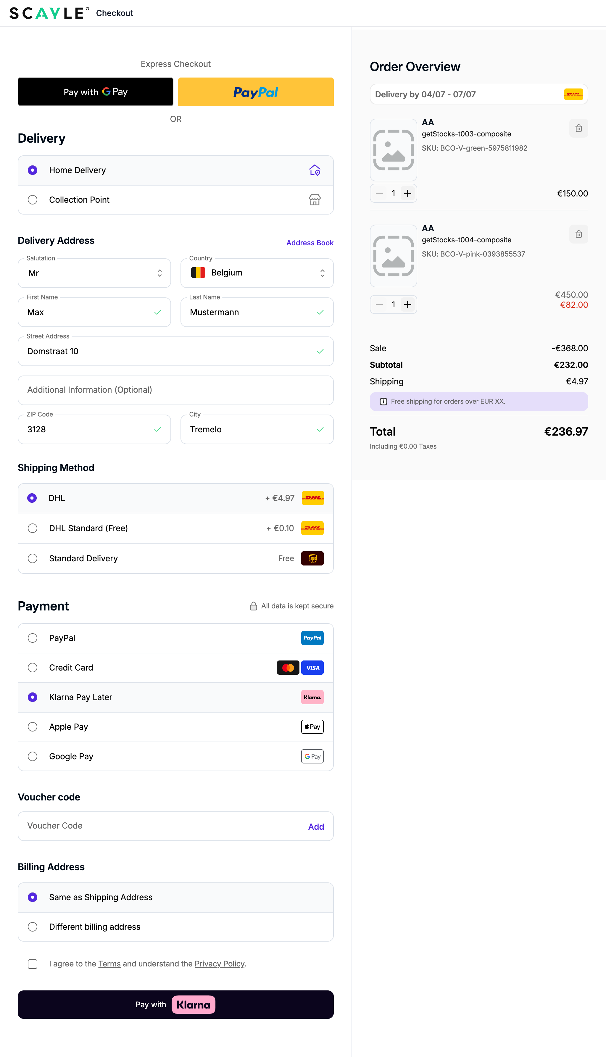
Prerequisites
- Your shop runs on the current SCAYLE Checkout component.
- You have access to the Checkout Editor in the SCAYLE Panel for the shop and scope you want to change.
Enable One Page Checkout
One Page Checkout is switched on per shop, country, and device, so you can roll it out gradually. A device only uses the one-page layout when it is selected in the Checkout Editor; any device not selected continues to use the standard multi-step flow.
- In the SCAYLE Panel, open the Checkout Editor for your shop.
Settings ➜ Checkout ➜ Customization - At the top of the Checkout Editor, choose the scope you want to change using the overwrite level (for example Global, a specific country, or a language).
- Open the One Page Checkout setting.
General Settings ➜ Layout ➜ Enable One Page Checkout - In the Devices field, select the devices that should use One Page Checkout. The available options are Desktop, Mobile, and App. You can select more than one.
🧑💻 For developers:
This maps tofeatures.singlePageCheckout.conditions.enabled.devicesin the checkout config schema, with the valuesdesktop,mobile, andapp. For example, selecting Mobile and App sets["mobile", "app"]and leaves desktop on the multi-step flow. - Preview the change in the editor, then save the section. Changes apply without a deploy or engineering ticket. The layout takes effect for the selected devices within the chosen scope; the most specific matching scope applies.
- Open the checkout on one of the selected devices to confirm the one-page layout renders. The available payment methods appear once the customer has entered their address, so a brief loading state on the payment section beforehand is expected.
Slide to Pay
Slide to Pay replaces the standard payment button with a swipe control on mobile and app devices. Instead of tapping to place an order, your customers swipe a handle across a track to confirm it. The deliberate gesture helps prevent accidental orders caused by mis-taps while scrolling.
Slide to Pay is turned off by default. Desktop is never affected and always keeps the standard payment button, whether or not Slide to Pay is enabled.
Prerequisites
Before you enable Slide to Pay, make sure that:
- One Page Checkout is enabled for the devices you want Slide to Pay on (mobile, app, or both), as described in "Enable One Page Checkout" above. Slide to Pay does not appear in the multi-step checkout flow.
Enable Slide to Pay
- In the SCAYLE Panel, open the Checkout Editor for your shop: Settings ➜ Checkout ➜ Customization
- At the top of the Checkout Editor, choose the scope you want to change using the overwrite level (for example Global, a specific country, or a language).
- Open the Slide to Pay setting and turn it on: Payment Step ➜ Payments ➜ Slide to Pay
🧑💻 For developers:
The SCAYLE Panel setting maps to
features.slideToPay.enabled, which defaults tofalse. Slide to Pay also requires One Page Checkout to be enabled for the same devices, so settingslideToPayon its own has no visible effect.
Where Slide to Pay appears
When enabled, the slide control replaces the confirmation button on both the payment step and the review step.
Slide to Pay also changes when the confirmation control becomes available. With Slide to Pay enabled, the Continue button changes into the slide control as soon as your customer has completed all required information. Without it, customers still see the Continue button and reach the payment button only after scrolling to the bottom of the page.
Appearance
The slide control uses your checkout's standard styling, except for Klarna, PayPal, and credit card. For those, it carries the branding of the selected payment method, so the confirmation step stays visually consistent with the method your customer chose.
Note: This is not configurable. The slide control keeps the payment method's branding whether or not branded payment buttons (
showBrandButtons) are enabled for your shop. The difference is visual only.
Behavior on errors
- Failed payment: the control resets to its starting position. Your existing error notification displays the message.
- Validation failure: if required fields are missing, the control resets and the order is not submitted.
Limitation
- Apple Pay and Google Pay continue to use their standard buttons and are not shown as slide controls.


