

Accessibility
The Storefront Application V3 ships the accessibility mechanics that every storefront needs: keyboard handling, focus management, screen reader announcements, accessible dialogs and form feedback, a lint rule set, and an opt-in axe crawl that finds mechanical problems. You reuse these pieces in each new feature instead of rebuilding them. What your content says and shows, such as alt text and heading order, stays yours to build and check.
Why it matters
A user who navigates by keyboard or screen reader has to be able to find a product, add it to the basket, and check out. A dialog that loses focus, a filter result that nobody announces, or a form error that a screen reader never reads each block that path. Shared composables and components give every new feature the same behavior from the first line, and the lint rules and the crawl catch the mechanical mistakes before a customer does.
Try it
Try it: tab through the skip links and the filter panel
Open the demo application, press Tab once, and the skip links slide into view. Then open a product listing page, open the filters, press Escape, and watch focus return to where you started.
What's included
- Keyboard handling:
useKeydownActionsturnsevent.keyinto named actions such asup,down,escape, andenter, and calls the handler you registered for that key. The dropdown, pagination, quantity input, and range slider use it. - Focus helpers:
getFirstFocusableandgetFirstFocusableAfterin@client/utils/focusfind the first focusable element in a container, or the first one after a region. The product grid and the product sliders use them to move focus into a region.useReturnFocusremembers the element that opened something and puts focus back on it. The header navigation flyouts and the account link use it. - Dialogs:
SFModalandSFSlideInrender a native<dialog>that the application opens withshowModal(). The browser traps focus and closes the dialog on Escape.useDialogBehavioradds the scroll lock, the backdrop click to close, and the Escape handling that keeps the exit transition in sync. Give each one an accessible name:SFSlideIntakeslabelorlabelledBy, andSFModaltakesheadline,label, orlabelledBy. - Overlay triggers: An overlay is a modal, slide-in, or popover that stays closed until a user opens it.
useOverlay().create()returnstriggerAttrsfor the button that opens it:aria-expanded,aria-controlsonce the overlay is in the DOM, andaria-busywhile the first open loads. By default, the attributes also start the download of the overlay's code when a pointer enters the button or focus lands on it. - Skip links:
SFSkipLinkis the first focusable element on a page. It stays off-screen until it receives focus. It always links to the main content, and the full layout adds links to the header search and the basket. Those two links are hidden below thelgbreakpoint, and the basket link is left out on the basket page. The link labels come from thecommon.skip_to_main_content,common.skip_to_search, andcommon.skip_to_baskettranslation keys. - Screen reader announcements:
useAnnouncersends a message to a live region, which is an area of the page that a screen reader reads out when its content changes.SFLiveAnnouncerrenders two of them, one withrole="status"for routine updates and one withrole="alert"for urgent ones. Each message is added as a new element and removed again after about a second, so the same text announced twice is read twice. Toast notifications and the filter result count announce through it. - Route announcements:
useRouteAnnouncerannounces "Navigated to" and the page title after an Inertia visit changes the title, because the browser only announces the title on a full page load. It skips the first title the page sets. On the search page it adds the number of results when there are any to count. - Form feedback:
useFormFieldFeedbackdecides which of the error, info, and helper text a field shows (an error wins over info, info wins over helper) and builds the matchingaria-describedby.SFTextInputandSFCheckboxuse it.useInvalidSubmitFeedbackfocuses the first invalid field after a rejected submit and announces how many fields need attention. The account profile forms use it. - Focus ring: One two-tone ring, defined once as the
focus-styleutility insrc/client/index.css, applies to every focusable element through the global*:focus-visiblerule.SFAccordionis a native<details>with a<summary>trigger, so it is keyboard operable and shows the same ring. - Established patterns:
SFDropdownfollows the WAI-ARIA select-only combobox pattern,SFImageGallerythe carousel pattern, andSFRangeSliderthe multi-thumb slider pattern. Each one names its pattern in a comment in its source. - Lint rules: The
eslint-plugin-vuejs-accessibilityrules run on the templates of your.vuefiles as part ofpnpm lint. - Storybook checks: The Storybook accessibility addon (
@storybook/addon-a11y) shows axe results for each story in the Storybook UI. - Axe crawl: The Playwright suite in
testing/playwright/can scan your pages with axe. It is opt-in and only reports. See Accessibility Testing for how to run it and read the results.
What you can change
Configure
- Reword the skip link labels, the route announcement, and other screen reader text in the locale files in
src/i18n/locales/. See Internationalization.
Theme
- Change the focus ring colors with
--color-focusand--color-focus-haloinsrc/client/design-tokens.css. Keep the two tones far apart in lightness, so one of them contrasts with whatever surface the ring lands on.
Extend
- Open a dialog from your own component with a focus trap, Escape to close, and focus restored.
- Announce a change to screen readers with
useAnnouncer. - Add keyboard support to a custom control with
useKeydownActions. - Restore focus to the element that opened a flyout you built without
<dialog>, withuseReturnFocus. - Give a new form control the same error, info, and helper text behavior as the shared fields with
useFormFieldFeedback. - Scan a state the crawl cannot reach, such as an open dialog or a half-filled form, by calling
a11y.checkA11y('label')in your own Playwright spec.
Constraints and limits
Permanent
- A modal
<dialog>makes everything outside itself inert, so the live regions in the page behind it cannot announce. Announcements explains howSFModalandSFSlideInhandle this. A dialog you build directly on<dialog>and open withshowModal()needs anSFLiveAnnouncerinside it, or announcements stay silent while it is open. announce()andclear()do nothing during server render. The message queues are shared by every request the server handles, so the SSR guard inuseAnnounceris the only thing that keeps one request's message out of another request's HTML. Announce from an event handler or from a watcher that reacts to a client-side change.- The axe checks are opt-in, only report, and find mechanical problems. They cannot judge the quality of alt text, focus order, or announcements, and a finding inside a SCAYLE web component is for SCAYLE to fix. See Constraints and limits and Decide who fixes a finding.
- The shared pieces cover mechanics, not content. Alt text for the images you upload, the heading order of a new page, the color contrast of a new color, and captions for a video stay your responsibility.
Known limitations
- The two pages that use
SimpleLayout, the checkout and the subscription cancellation, render only the main content skip link. The layout mounts noSFLiveAnnouncerand does not calluseRouteAnnouncer. On those pagesannounce()is silent outside an openSFModalorSFSlideIn, and a visit is not announced. To change that, add<SFLiveAnnouncer />to the layout, anduseRouteAnnouncer()as well if those pages set their title throughPageMetaHead. - The debounce timer of
announce()is keyed by politeness, not by caller. Anyannounce()call cancels the pending debounced message of the same politeness, so two components that debounce at the same politeness within the window cancel each other, and the earlier message is never announced. A call without thedebounceoption cancels it too. If you need guaranteed delivery from one source, debounce in your own code, for example withuseDebounceFnfrom@vueuse/core, and callannounce()without thedebounceoption. - The lint rules inspect the templates of
.vuefiles. Nothing in the Vitest component tests runs axe, so rendered checks come only from Storybook and the Playwright crawl.
How it works
Dialogs and focus
When a dialog component renders open, the v-dialog.modal directive calls showModal() and moves focus to the <dialog> element itself. It leaves focus to the browser when a child carries autofocus. Focusing the dialog avoids a focus ring on the close button that nobody asked for, and the dialog carries the accessible name that a screen reader reads first. The browser then traps focus inside the dialog, makes the rest of the page inert, and fires a cancel event when the user presses Escape.
useDialogBehavior listens for that event and blocks the native close. It sets the open model to false instead, so the leave transition can play. The directive calls close() when the transition ends, and the browser returns focus to the element that had it before the dialog opened. A user who opens the dialog with the keyboard lands back on the button they pressed.
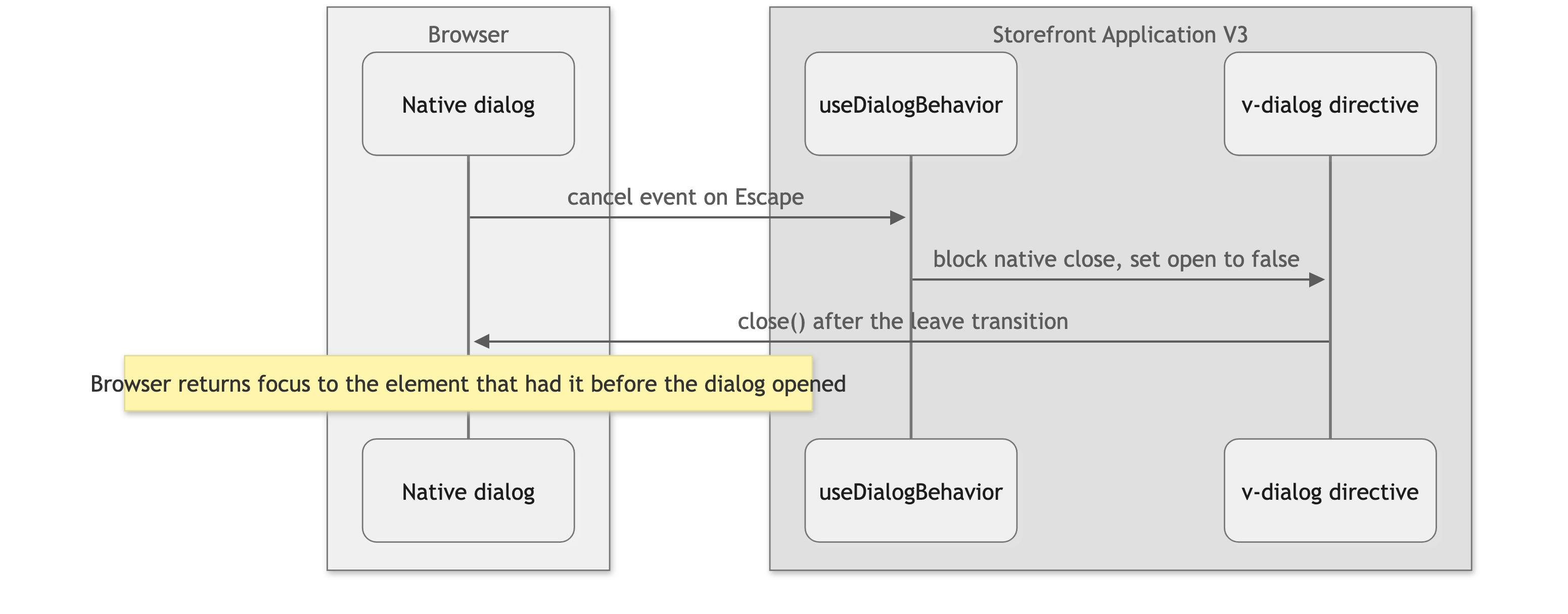
The close button and a click on the backdrop take the same path without the cancel event. Both call close() in useDialogBehavior, which sets the open model to false.
Announcements
useAnnouncer keeps two message queues at module level, one polite and one assertive. announce(message) adds a message to a queue, and SFLiveAnnouncer renders each queue inside its live region. Layout.vue renders one SFLiveAnnouncer for the whole page, and every open SFModal and SFSlideIn renders another, because the page behind a modal dialog is inert. A message is appended as a new element and pruned after about a second. Screen readers pick up an inserted element more reliably than a changed text node, and a new element for each call is why identical messages are read again.
Setup
Run the axe crawl against your shop
From testing/playwright/, run pnpm test:e2e:a11y, then pnpm a11y:summary to print the findings. Crawl your shop covers the setup, the replay of your own specs, how to read the summary, and how to run the checks in a pipeline.
Customization guides
Open a dialog from your own component
You end up with a button that opens a dialog. The browser traps focus inside it, Escape closes it, and focus returns to the button when you opened it with the keyboard.
Before you start, decide between SFModal for a centered dialog and SFSlideIn for a panel at the screen edge. The example uses SFModal. SFSlideIn binds its open state with the isOpen model instead of visible.
- Build the dialog component on
SFModal. Passheadline, orlabelorlabelledByfor a custom layout, so the dialog has an accessible name. Declare anopenmodel on your component. The overlay host sets it, and you bind it to thevisiblemodel ofSFModal. The host also passes anid, whichSFModalforwards to the<dialog>.
- In the component that holds the button, call
useOverlay().create()with a dynamic import of your dialog. Return the props through a getter, so a partial reload updates an open dialog. - Bind
triggerAttrson the button and callopen()on click.
When it works, activating the button opens the dialog and moves focus into it. Tab stays inside the dialog, Escape closes it, and focus goes back to the button.
Announce a change to screen readers
You end up with a message that a screen reader reads without moving focus.
Before you start, have the translation key for the message in src/i18n/locales/en_GB.json. announce() takes an already translated string.
- Get
announcefromuseAnnouncer. - Call it with the translated message when the change happens. The default politeness is
polite, which waits for the current utterance to finish. Use it for result counts, confirmations, and other routine updates. Passpoliteness: 'assertive'only for errors and deliberate navigation, because it interrupts the screen reader. - For changes that can arrive in quick succession, pass
debounce: ANNOUNCE_DEBOUNCE_MS, so only the last message is read.
When it works, the polite live region (data-testid="live-announcer-polite") gets a child element with your text for about a second. Open your browser's developer tools to watch it, then confirm with a screen reader.
Add keyboard support to a custom control
You end up with a control that reacts to arrow keys, Home, and End the way users expect from the matching WAI-ARIA pattern.
Before you start, pick the pattern your control follows in the WAI-ARIA Authoring Practices and note which keys it defines.
- Give the control a
role, an accessible name, the value attributes the pattern requires, and atabindexso it takes focus. - Call
useKeydownActionswith a map from normalized key names to handlers. The names areup,down,left,right,home,end,enter,escape,space, andtab. Any other key becomes its lowercaseevent.key. - Bind the returned handler to
@keydown. A matched key callspreventDefault()unless you passpreventDefault: false. A key you did not map is left alone. PassstopPropagation: truefor a control nested in a parent that also listens forkeydown.
When it works, focusing the control and pressing the mapped keys runs your handlers, and keys such as Tab still move focus on.
Best practices
Build dialogs on SFModal or SFSlideIn
Hand-written focus trapping on a <div> loses what the native <dialog> gives you. See Dialogs and focus.
Leave the focus ring alone
Do not cancel the global ring with outline-none or shadow-none, and do not give a component its own :focus-visible colors. The two-tone ring is what keeps the indicator visible on light and dark surfaces. Where an overflow-hidden parent clips it, use focus-visible:focus-style-inset on the element.
Give every lint exception a reason
When a vuejs-accessibility rule is wrong for your markup, disable that one rule and say why, for example <!-- eslint-disable-next-line vuejs-accessibility/mouse-events-have-key-events -- Hover only opens the popover for pointer users. Keyboard users open it with the trigger button. -->. The exceptions already in the application follow this form, and the reason is what tells the next reader who else covers the keyboard path.
Walk through a purchase with only the keyboard
Add a product, open the basket, and check out without touching the mouse. Confirm that every control is reachable in a logical order, shows the focus ring, and never traps you.
Run a screen reader through the same purchase
Use VoiceOver on macOS or NVDA on Windows. Confirm that a screen reader user can finish the purchase and hears the announcements you added.
Check zoom and reduced motion
Zoom the browser to 200 percent and confirm that nothing is cut off. Turn on prefers-reduced-motion in the Rendering panel of Chrome DevTools and confirm that your animations respect it. Use the motion-safe: and motion-reduce: variants for your own animations.
Troubleshooting
Lint fails with a vuejs-accessibility error
Issue: pnpm lint reports an error from a vuejs-accessibility/... rule on a template you wrote.
Possible causes: All rules of the plugin run at error. Common triggers are a @click on an element that is not a button or link, a @mouseover without a keyboard equivalent, and a <label> that neither wraps its control nor has a for that matches the control's id. The label rule accepts either way, so you do not need both.
Solution:
- Read the rule name in the error.
- Use a native
<button>or<a>where the element is clickable, or add the keyboard handler andtabindexthe rule asks for. - If the markup is correct, disable that one rule on that line with a reason.
Prevention: Start from native elements and add ARIA only where HTML has no element for the job.

