

Site Navigation
Site navigation is the menu a user clicks to reach categories and pages: a header menu with flyouts on large screens, a drawer on small screens, and a footer. You build each menu as a navigation tree in the SCAYLE Panel, and the Storefront Application V3 fetches the trees from the Storefront API and renders them around your pages.
Why it matters
The menu is the main route from any page to your category pages. The header menu is part of the server-rendered HTML, so search engines see its category links as well.
One navigation tree feeds both the desktop header and the mobile drawer, so a menu edit in the SCAYLE Panel shows up in both.
Try it
Try it: navigate using the main menu and shop switcher
Open the demo shop, hover a menu item to open its flyout, then narrow the window to switch to the drawer. The checkout page shows the simplified header.
Try it: open the checkout page to see the simplified header (requires at least one product in the basket)
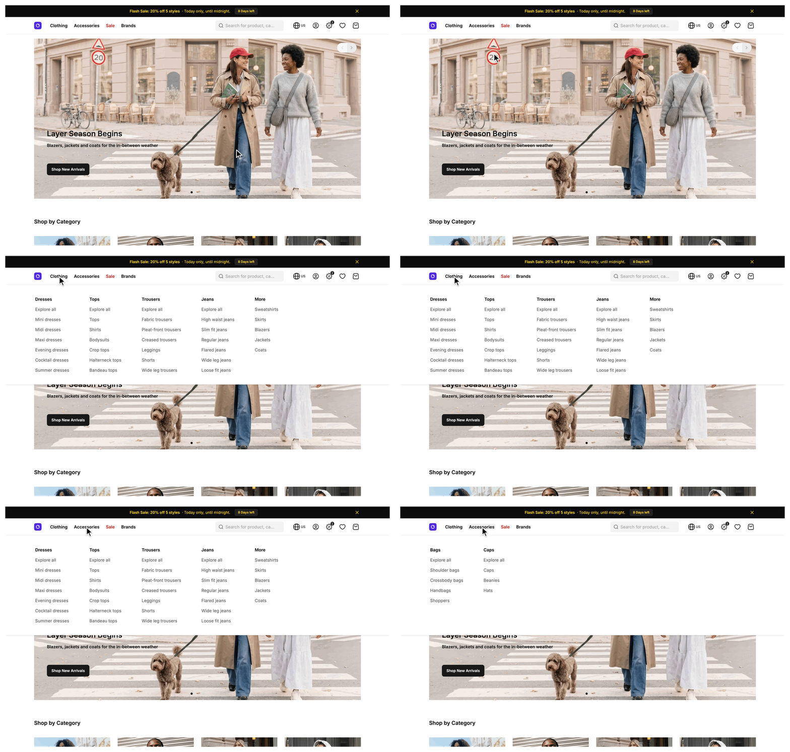
Desktop header navigation
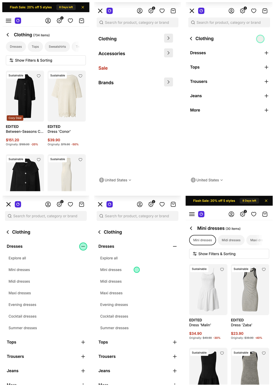
Mobile header navigation
What's included
- Header menu:
SFHeader.vueshows theheadertree as a bar from thelgbreakpoint up. Hovering an item opens a flyout with its second level as columns and its third level as rows. Keyboard users open the flyout with a submenu button that appears on focus, and Escape closes it. - Mobile drawer: below
lg, a menu toggle opensSFMobileSidebar.vue. It shows the sameheadertree, the search field, the shop switcher, and a sign-out button for a signed-in customer. An item with children has a chevron button next to its label. The button opens a second panel, and the third level expands as an accordion inside that panel. Tapping the label follows the item link and closes the drawer. - Footer:
SFFooter.vueshows thefootertree as link sections. A section heading is never a link. On small screens each section collapses into an accordion, and on large screens all sections stay open. - Legal row:
SFBottomFooter.vueshows the copyright line and thecheckout_footertree. It also shows a privacy settings button when your shop requires consent management, see Consent management. The main footer and the simplified layout both render it. - Simplified checkout header:
SFSimpleHeader.vueshows a back-to-shop link and the logo. From themdbreakpoint up it also shows thecheckout_headertree. - Header utilities: the header holds the search field, the shop switcher, an account icon, a promotions button, a wishlist link and a basket link. The account icon opens a popover on large screens and links to the account or sign-in page on small screens. The promotions button opens a slide-in, see Promotions. The wishlist and basket links show a count badge.
- Shop switcher: lets a user move between the shop countries and languages of your shop. It renders only when your shop has more than one country and language combination. Each choice is a link to the home page of the target shop. It sits in the header on large screens and in the drawer on small screens.
- Menu item options: an item can carry an SVG icon, a link color, a disabled flag, an opens-in-new-window flag for individual links, category filters that turn a category link into a pre-filtered listing, and a visibility schedule. The table under SCAYLE Panel shows where each option takes effect.
- Active category highlight: in the header bar, a top-level item shows as active while its link starts with
/c, the prefix of category listing pages, and equals the current path. See Constraints and limits for when no item lights up. - Skip links:
SFSkipLink.vueis the first focusable element on a page. It offers a link to the main content. The main layout adds links to the search field and the basket link on large screens, and leaves out the basket link on the basket page.
What you can change
Configure
- Build and order the
header,footer,checkout_footerandcheckout_headertrees in the SCAYLE Panel, including nesting, item targets, SVG icons, visibility schedules and category filters. - Set the link color and the disabled flag of an item through custom data in the SCAYLE Panel.
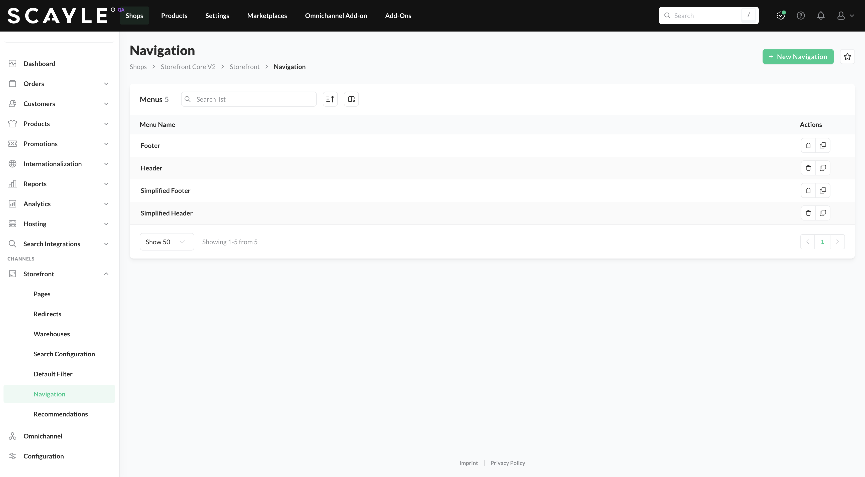
Navigation menus in the Panel
Theme
- Restyle or rebuild the header, drawer, footer and simplified header components in
src/client/components/ui/navigation/, and the two layoutssrc/client/layout/Layout.vueandsrc/client/layout/SimpleLayout.vue. They read thenavigationandfootershared props and thecheckoutHeaderpage prop as plain data, so you can change markup, styling and the number of rendered levels without touching the server.
Extend
- Add a custom field to every navigation item in your
NavigationMapperService. - Change how an item resolves its link by setting
hrefafter the spread in the samemapNavigationItemoverride. This is how you give apagetarget a link. - Fetch a menu from another source by subclassing
NavigationService, overridingfetchHeaderNavigation,fetchFooterNavigationorfetchCheckoutHeaderNavigation, and registering the subclass on thenavigationslot ofserviceRegistryinsrc/server/registries.ts. A slot is the registry entry that holds one class instance for a request, see Extending the SDK.
Constraints and limits
Permanent
- The header menu follows the
headernavigation tree you build, not your category tree. Only an item that targets a category links to a category.
Known limitations
- The header menu renders three levels. The footer renders two levels, the section headings and their links. The legal row and the simplified header render the top level only. The Storefront Application V3 fetches deeper levels but does not render them. To show more levels, change the components.
- A change to a menu in the SCAYLE Panel can take up to 2 minutes to show on a full page load, see Data cache TTLs. The cache is off when
STOREFRONT_CACHE_DISABLEDistrue, which.env.examplesets. Two more delays can stack on top. The client reuses thenavigationandfooterprops for in-app visits until the next full page load. A CDN that honors thes-maxageheader can serve a cached page, menus included, until the route's own lifetime ends, see Configure cacheable routes. - An item you schedule to appear or disappear can take a little longer than that to change, because the request rounds its time down to the minute.
- A
pagetarget has no link of its own, so itshrefis#. The link component turns#into a link to the home page of the active shop, and apagetarget also opens in a new window. Give it a link in your mapper, see Extend under What you can change. Acategorytarget whose category is gone ends up on the home page the same way, see Troubleshooting. - The active category highlight compares the link of a top-level item with the current path. The link must start with
/c, the prefix of category listing pages, and equal the path, so a subcategory page does not light up its parent, and neither does an item whose link carries Panel filters. Under the defaultpathcountry selector, and for a non-default country underpath_except_default, the current path starts with the country prefix and the link does not. No item lights up there, see Routing for the country selector. - Only the checkout page supplies the
checkout_headertree. The subscription cancellation page uses the sameSimpleLayout.vue, but its controller passes nocheckoutHeader, so its header shows the back link and the logo only. - The four reference keys are fixed in
NavigationService. A tree under any other key is never fetched. To fetch another tree, add your own fetch method to aNavigationServicesubclass, because the key-based fetch inNavigationServiceis private. - An item shows an icon only when one of its assets is an
.svgfile. The mapper ignores every other file type without a warning. Icons render as images, so CSS cannot recolor them.
How it works
Where the menus come from
A NavigationItem is the shape every menu item has when it reaches a component: an id, a name, a resolved href, an openInNewWindow flag, an optional icon, its children, and the linkColor and disabled fields that the Storefront Application V3 adds. A mapper is the class that turns a Storefront API response into that shape.
NavigationService in @scayle/storefront fetches one navigation tree per reference key, the key that identifies a tree in the Storefront API. It passes each tree to the mapper registered on the navigation slot of the mapper registry, which is your NavigationMapperService. The request carries a visibleAt timestamp, so the Storefront API returns only items that are visible at that time.
Two places call the service. The shared-data middleware in src/server/middleware/sharedData.ts reads services.navigation and adds two shared props, which are Inertia props that the server adds to the pages it renders. navigation holds the header tree. footer holds an object with footer and bottomFooter, which come from the footer and checkout_footer trees and are fetched together. CheckoutController fetches the checkout_header tree itself and passes it as the checkoutHeader page prop.
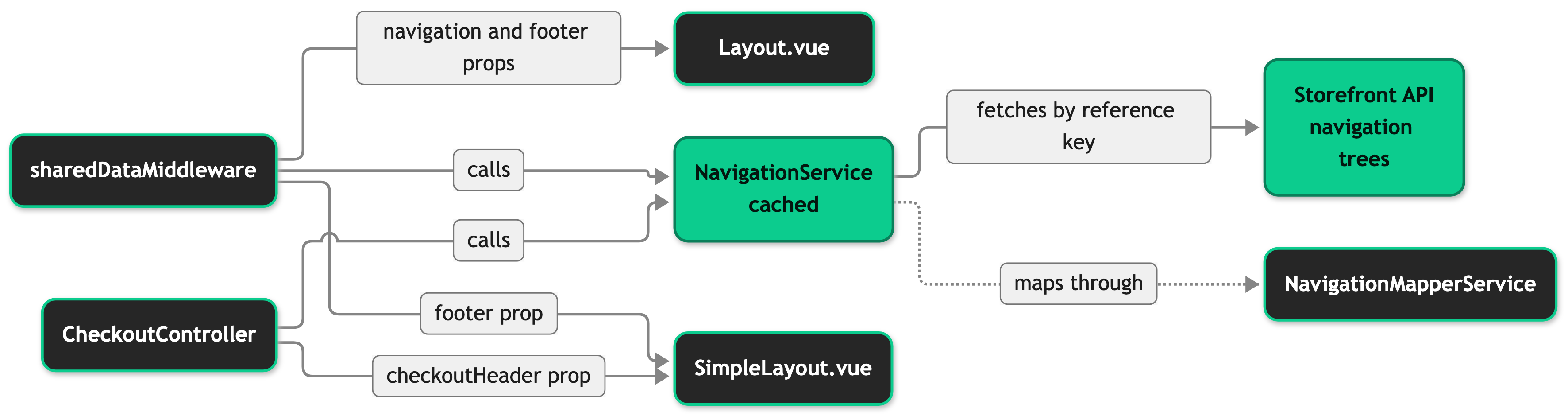
Layout.vue is the default layout of a page. SimpleLayout.vue is the layout of the checkout page and the subscription cancellation page.
Both shared props are once props, see Props and when they load. The server resolves them on a full page load and skips them for an in-app visit when the client reports that it already holds them, so moving between pages does not fetch navigation again.
If the request for a tree fails, the service logs the error and returns undefined. The middleware and the controller turn that into [], because navigation is page chrome that every layout expects, so the menu renders empty and the page still renders. The two footer trees are fetched together but fail separately, so one failing leaves the other intact. An error thrown by your own mapper override is not caught. See Troubleshooting for how to find a failed request.
How the menus load in the browser
The desktop menu is part of the server-rendered HTML. The mobile drawer is a separate component that the browser loads. Below lg it loads once the browser is idle after the page has mounted, and on wider screens it loads only when a user opens it.
Configuration
SCAYLE Panel
The Storefront Application V3 reads four navigation trees by reference key. Make sure the keys in your SCAYLE Panel match exactly as shown (SCAYLE Panel: Shops ➜ Storefront ➜ Navigation). For details on configuring navigations in the SCAYLE Panel, see Shop Navigation.
| Menu | Reference key | Rendered by |
|---|---|---|
| Header | header | SFHeader.vue for the desktop bar and flyouts, SFMobileSidebar.vue for the drawer |
| Footer | footer | SFFooter.vue |
| Legal links | checkout_footer | SFBottomFooter.vue in the main footer and in the simplified layout |
| Simplified header | checkout_header | SFSimpleHeader.vue in SimpleLayout.vue |
The target of an item decides its link and whether it opens in a new window.
| Target | Link | Opens in a new window |
|---|---|---|
category | The category's listing page, with the item's Panel filters appended as query parameters. # when the category is deleted or not visible in the current shop. | Never |
individual-link | The URL of the item. | The item's own flag |
page | # | Always |
The mapper reads two custom data fields that change how an item behaves. Both fields must be created in the SCAYLE Panel before use (Custom Data: Settings ➜ General ➜ Custom Data ➜ Navigation Item).
| Custom data key | Produces | Used for |
|---|---|---|
linkColor | NavigationItem.linkColor | Any CSS color value. The item label uses it as text color, and the hover background uses it at 10 percent opacity. |
disabledLink | NavigationItem.disabled | Renders the item as a plain label instead of a link, where the table below allows it. A disabled top-level item in the header bar is a label that still opens its flyout. |
The table shows where each option takes effect. The Link column says whether the item renders as a link: always, never, or unless its disabled flag is set.
| Where | Link | Icon | Link color | Opens in new window |
|---|---|---|---|---|
| Header bar, top level | Unless disabled | Yes | Yes | Yes |
| Desktop flyout, column headings (second level) | Always | No | No | No |
| Desktop flyout, rows (third level) | Unless disabled | Yes | Yes | Yes |
| Drawer, top level | Always | Yes | Yes | Yes |
| Drawer, accordion headings (second level with children) | Never | Yes | Yes | Not a link |
| Drawer, other second-level and third-level items | Unless disabled | Yes | Yes | Yes |
| Footer, section headings | Never | Yes | Yes | Not a link |
| Footer, links | Unless disabled | Yes | Yes | Yes |
| Legal row | Unless disabled | Yes | No | Yes |
| Simplified checkout header | Unless disabled | Yes | No | Yes |
The legal row and the simplified header render items without the link styles, so the link color has no effect there. Category filters and the visibility schedule apply wherever an item appears, because the mapper and the request resolve them before any component renders.
Customization guides
Add a custom field to every navigation item
You end up with a field of your own on every item of the four trees, at every depth. The Storefront Application V3 adds linkColor and disabled the same way, so you add your line next to those. Override mapNavigationItem when a custom data value of an item should change how it renders or links.
Before you start, create the custom data field for navigation items in the SCAYLE Panel (Settings ➜ General ➜ Custom Data ➜ Navigation Item). The key you declare in step 1 must match the key in the SCAYLE Panel.
- Declare the key on the Storefront API type in
src/shared/types/customData.ts. The snippet shows the part of the file you change. - Declare the field on
NavigationIteminsrc/shared/types/Navigation.tsand keepexport {}at the end of the file. It keeps the file a module, so TypeScript reads thedeclare moduleblock as an augmentation and not as a new declaration. - Read the key in
mapNavigationItemof yourNavigationMapperService, after the spread. - Read the field where you render items.
SFNavigationTreeItem.vuerenders the items of the header bar, the flyout rows, the drawer, the footer and the simplified header.SFDesktopNavigationFlyout.vuerenders the flyout column headings itself.
When it worked, TypeScript accepts navigationItem.yourField in components, and every item in the navigation prop carries the value.
The base mapper builds children through this.mapNavigationItem, so your override applies at every depth and you write no recursion. Start the returned object with ...super.mapNavigationItem(item). Dropping it fails type checking for the required fields id, name, href, openInNewWindow and children. Building all of them by hand compiles, but loses the optional icon and any field that a later @scayle/storefront release adds.
Best practices
Keep the checkout header to a few short links
SFSimpleHeader.vue places the logo in the center of the header. At a width of 768 pixels the links get about 350 pixels beside it, which fits four short links. More links, or longer ones, run under the logo.
Turn the cache off while you edit menus locally
Keep STOREFRONT_CACHE_DISABLED=true in your local .env file, as .env.example sets it, and reload the page in full after a Panel edit. The browser keeps the navigation and footer props across in-app visits.
Troubleshooting
A menu renders empty
Issue: The header, footer, legal row or simplified header shows no items, and the rest of the page renders.
Possible causes:
- The request to the Storefront API for that tree failed, and the page fell back to an empty menu.
- The tree has no item that is visible at the time of the request, for example when every item is scheduled for a later start.
Solution:
- Search the server logs for
Failed to fetch navigationand read itsreferenceKeyfield. - If an entry names the key, check that the Storefront API is reachable and that the tree exists in the SCAYLE Panel under that key.
- If the logs show no entry, open the tree in the SCAYLE Panel and check the visibility schedule of its items.
Prevention: None of these can be ruled out in code, because they depend on the Storefront API and on the data in the SCAYLE Panel. To render a fallback menu, change the ?? [] in src/server/middleware/sharedData.ts. The service returns undefined for a failed fetch and [] for an empty tree.
A menu item opens the home page
Issue: A click on a menu item opens the home page of the shop instead of the expected page.
Possible causes:
- The item targets a category that was deleted or is not visible in the current shop, so its link is
#.
Solution:
- Open the item in the SCAYLE Panel navigation (SCAYLE Panel: Shops ➜ Storefront ➜ Navigation).
- Check that its category still exists and is visible in the shop country.
- If the item should not link anywhere, set its disabled custom data field. See the table under SCAYLE Panel for where this works.
Prevention: None of these can be ruled out in code, because categories change in the SCAYLE Panel independently of the navigation tree.

