

Design System
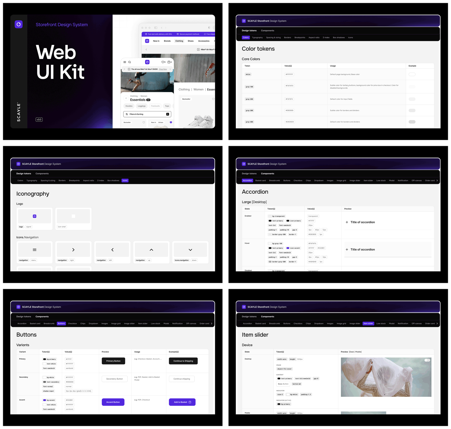
The Storefront Design System is the Figma library behind the Storefront Application V3. It holds the same design tokens and base components that the code uses, named the way developers write them. Designers and developers share one vocabulary, so a design decision turns into code without guesswork. The recommended way to use it is with an AI agent.
Why it matters
A color, border, text style or shadow in Figma carries the name of the Tailwind class that renders it, and a developer who inspects a design can write bg-gray-200 or text-md font-semibold directly. Brand colors, fonts, corner radius and spacing sit in a small set of foundation variables, so a rebrand is one change in Figma and one change in a single CSS file.
What's included
- Design tokens: Colors, typography, spacing and sizing, borders, breakpoints, aspect ratios, z-index, box shadows and icons, each on its own page.
- Foundation variables: Raw values for core, accent and functional colors, font family, size, weight and line height, the spacing scale, radius and border widths, breakpoints and shadow parameters.
- Semantic tokens: Variables for backgrounds, text, borders and icons, named after their Tailwind classes, such as
bg-gray-200,text-secondaryandborder-gray-400. - Text and effect styles: Text styles from
text-sm/normaltotext-3xl/bold, shadow styles and focus styles. - Base components: Component pages, from buttons, chips and form controls to modals, off-canvas panels, product cards, prices and the basket card.
- Preview: An overview frame for every token page and component page.
Work with an AI agent
An AI coding agent is the recommended way to turn a Figma design into code and to carry design changes into the storefront. It reads a design through Figma's MCP server and writes code by the rules in the project's instruction files. Because Figma variables carry the names of Tailwind classes, and design-tokens.css names the Figma source of its color, spacing, and border token groups, the agent maps a design to code without a lookup table.
Before you start, duplicate the design system into your team's Figma workspace, see Start your project file.
The examples use Claude Code. For other assistants, see Using another assistant.
What the agent already knows
The project ships the rules an agent needs to turn a design into code that fits the storefront.
src/client/CLAUDE.mddefines the client design rules: Tailwind utilities only and no<style>blocks, theme tokens instead of arbitrary values, one sharedfocus-styleutility for keyboard focus, and the Type Hierarchy utilities for text.- The comment headers in
design-tokens.cssname the Figma variables of the color, spacing, and border token groups, for exampleFigma: Colors/Accent/*.
Connect Figma to your agent
Figma's MCP server gives an agent the design context of a frame: its layers, components, variables and styles. Add the remote server once per machine. For Claude Code:
Other assistants use the same server URL in their own MCP settings. Figma's guide to the MCP server covers the setup for each client and the plan and seat requirements.
Implement a design
An agent turns a Figma frame into a working storefront section in one session. Start the session in src/client/ so the agent loads both the root and the client instruction files, then share the link to the frame:
Apply a rebrand
After a designer updates the Foundation variables, an agent can carry the new values into the code:
Find drift between Figma and the code
An agent can also compare a Figma component with its code counterpart, which helps before a release or after a larger design change:
Good to know
- The agent sees only what the Figma file contains. Raw hex values and detached components in a frame lead to raw values in the code.
- Figma's Code Connect can link Figma components to SF components, so the MCP server returns the matching component directly. It is optional and not set up in the design system file.
Constraints and limits
- The code is the source of truth. When Figma and
design-tokens.cssdisagree, the code value applies and the Figma file gets updated. - Changes in Figma do not sync to the code automatically. A developer or an AI agent applies them in
src/client/design-tokens.css. - Not every component has a Figma design. Account pages, order confirmation, filters, category navigation, checkout, pagination and the header and footer navigation exist only in code. Design new screens for these areas with the existing tokens and base components.
How it works
Figma and the code follow the same token chain. In Figma, foundation variables hold the raw values, semantic tokens point to foundation variables, and components use only semantic tokens and styles. In the code, src/client/design-tokens.css holds the same raw values as Tailwind theme variables, and Tailwind generates the utility classes that the components use, as the Tailwind theme variables guide describes.
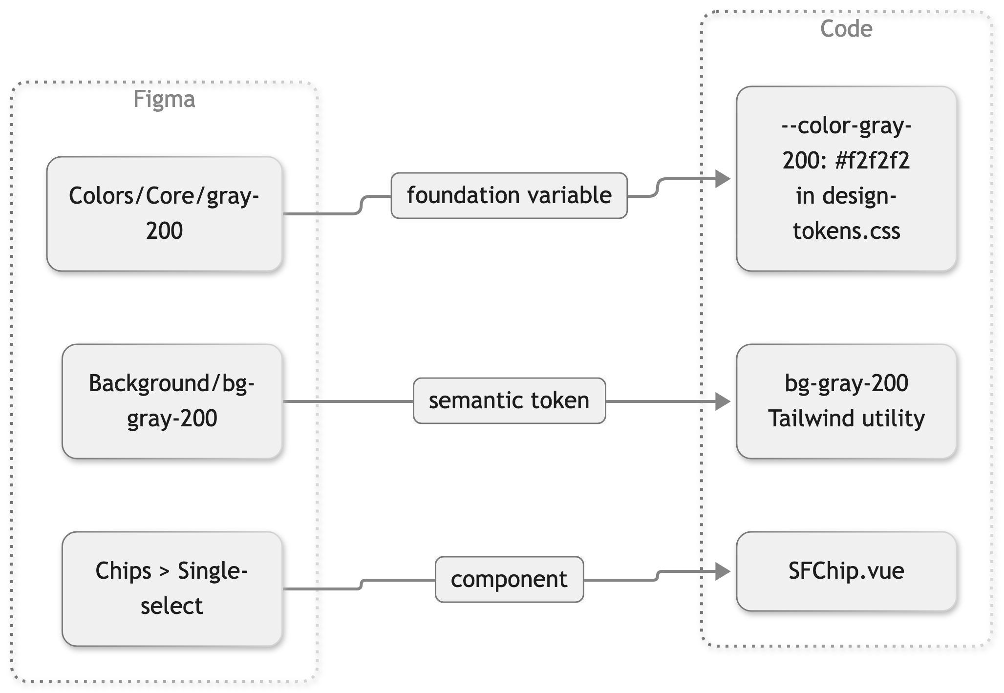
The color, spacing, and border sections of design-tokens.css name their Figma source in a comment header, for example Figma: Colors/Accent/* or Figma: Spacing/Blocks/*. The typography, aspect ratio, box shadow, and breakpoint sections name none.
Figma measures in pixels and the code in rem. One rem equals 16 px, so a 44 px button in Figma is 2.75rem in the code.
Token mapping
| Figma | Example in Figma | Code token | Tailwind class |
|---|---|---|---|
| Colors/Core, Colors/Accent, Colors/Functional | Colors/Accent/accent | --color-accent | text-accent, bg-accent, border-accent |
| Background, Text, Border and Icon tokens | Background/bg-gray-200 | --color-gray-200 | bg-gray-200 |
| Spacing/Blocks | spacing-1-5 | --spacing-1_5 | p-1.5, gap-1.5 |
| Border/Radius | rounded-lg | --radius-lg | rounded-lg |
| Border/Width | border-2 | Tailwind border widths | border-2 |
| Text styles | text-md/semibold | --text-md, --font-weight-semibold | text-md font-semibold |
| Effect styles | shadow/overlay | --shadow-overlay | shadow-overlay |
| Focus styles | focus/outline, focus/outline-inset | focus-style utilities in index.css | focus-style, focus-style-inset |
| Type hierarchy | Heading › Page, Section level 1 to 3, Body, Disclaimer | Type Hierarchy utilities in index.css | heading-page, heading-section-1, body-default, body-large, disclaimer |
| Breakpoints | screen-md | --breakpoint-md | md: prefix |
Component mapping
Figma component names describe what designers see. Code component names start with SF and live under src/client/components/. Variant properties in Figma correspond to props in the code. For example, the Figma Button has the variants Primary, Secondary, Accent and Plain and the sizes Small (sm) to Extra Large (xl), which match the variant and size props of SFButton. State names can differ: the Figma state Skeleton is the loading prop in the code.
The table lists every Figma component page that has a counterpart in the code, in alphabetical order. Locations are relative to src/client/components/.
| Figma page | Code components | Location |
|---|---|---|
| Accordion | SFAccordion, SFAccordionGroup | ui/accordion/ |
| Basket card | SFBasketCard | basket/ |
| Breadcrumb | SFBreadcrumb | ui/breadcrumb/ |
| Buttons | SFButton | ui/core/ |
| Checkbox | SFCheckbox, SFCheckboxBase, SFColorSwatch | ui/form/ |
| Chips | SFChip | ui/core/ |
| Dropdown | SFDropdown, SFDropdownOptionGroup, SFDropdownOptionItem | ui/form/ |
| Image / Video Grid | SFProductImageGrid | product/detail/productGallery/ |
| Image slider | SFImageGallery | ui/core/ |
| Images | SFProductImage, SFProductThumbnail | product/ |
| Item slider | SFItemSlider, SFImageSliderDots | ui/core/ |
| Low stock indicator | SFLowStockBanner | product/ |
| Modal | SFModal | ui/core/ |
| Notification | SFToast, SFHint | ui/toast/, ui/core/ |
| Off-canvas | SFSlideIn | ui/core/ |
| Order card | SFAccountOrderCard | account/orders/ |
| Popover | SFPopover | ui/core/ |
| Price | SFProductPrice | product/ |
| Product card | SFProductCard, SFWishlistToggle, SFProductCardInBasketBadge, SFDealBadge | product/, deal/ |
| Product slider | SFProductSlider | product/slider/ |
| Promotion banner | SFDealBanner, SFProgressBar | deal/ |
| Quantity selector | SFQuantityInput | product/ |
| Radio button | SFRadioBase | ui/form/ |
| Search | SFSearchResultsContainer, SFSuggestionGroup, SFCategorySuggestion, SFNavigationItemSuggestion, SFProductSuggestion | search/ |
| Sibling selector | SFSiblingSelection | product/detail/ |
| Text input | SFTextInput, SFPasswordInput, SFSearchField | ui/form/ |
| Text link | SFLink | ui/links/ |
| Toggle | SFSwitch, SFSwitchBase, SFSwitchGroup | ui/form/ |
| Type hierarchy | SFLabelValue | ui/core/ |
| Utilities | SFSkeletonLoader, SFAccountOrderStatus | ui/core/, account/orders/ |
| Videos | SFProductVideoSlide | product/detail/productGallery/ |
The Type hierarchy page also maps to the Type Hierarchy utilities in src/client/index.css, as listed in the token mapping above.
Best practices
For designers
- Use semantic tokens (Background, Text, Border, Icon) for fills and strokes, not foundation colors or raw hex values.
- Use the text styles and the Type hierarchy components instead of custom font settings.
- Show states with component variants, such as Hover, Disabled or Skeleton, instead of overrides.
- Pick spacing from
Spacing/Blocksso every gap and padding has a code token.
For developers
- Write the class named in Figma. Avoid arbitrary values such as
bg-[#f2f2f2], which bypass the tokens. - Raise any value without a token before implementing it.
- When you add a token group to
design-tokens.css, name its Figma source in the comment header like the existing groups.
Customize your storefront by hand
Without an AI agent, you carry a design change into the code yourself. A rebrand is two steps: change the foundation values in Figma, then the matching tokens in design-tokens.css. Every semantic token and component inherits from them, so most brand work needs no new components.
Start your project file
Finish Set Up Your Storefront first. Then duplicate the Storefront Design System into your team's Figma workspace and publish it as a team library. Keep the variable, style and component names unchanged, since the handoff to the code relies on them.
Apply your brand in Figma
Change the values in the Foundation collection. Semantic tokens and components update automatically because they reference the foundation variables.
| What to change | Figma variables | Code tokens |
|---|---|---|
| Brand colors | Colors/Accent/* | --color-primary, --color-secondary, --color-accent, --color-promotion, --color-campaign |
| Sale and status colors | Colors/Functional/* | --color-product-sale, --color-status-* |
| Font | Font/Family/* | --font-sans and the font import in index.css |
| Corner radius | Border/Radius/* | --radius-* |
| Spacing | Spacing/Blocks/* | --spacing-* |
| Shadows | shadow/* effect styles | --shadow-* |
Apply the same values in the code
Copy each changed value into the matching token in design-tokens.css. Tailwind regenerates every class that depends on it, so no component changes are needed. Theming shows an example edit and explains each token group in the code.
Design new screens and components
Build new screens from existing components and semantic tokens. When a design needs a value that does not exist yet, add it as a new variable in Figma and name it after the Tailwind class it becomes, for example Background/bg-brand-50 for a new --color-brand-50 token. The developer then adds the same token to design-tokens.css, and the class name in Figma is the class name in the code.
Troubleshooting
Dev Mode shows a hex or pixel value instead of a token
Issue: The inspect panel shows a value like #f2f2f2 or 14px instead of a token name.
Cause: The layer uses a raw value or a detached component instead of a variable or style.
Solution: Replace the value in Figma with the closest existing token. If no token fits, add one in Figma and in design-tokens.css.
Prevention: Design only with variables, styles and component instances from the library.
The agent writes arbitrary values instead of token classes
Issue: Code generated from a Figma frame contains values like bg-[#f2f2f2] or p-[14px].
Cause: The frame uses raw values or detached components, or the session started outside src/client/ and missed the client instruction file.
Solution: Replace the raw values in Figma with variables and styles, start the session in src/client/, and ask the agent to use only token classes.
Prevention: Design only with library variables, styles and components, and keep the instruction to list missing tokens in your prompt.


